Forms
Forms are used for entering and editing data.
Overview
A form allows users to provide data or configure options. They can be simple or complex, and may be presented within dialogs or their own dedicated page depending on the use case and the situation.
Parts
Forms are comprised of 5 parts: 1. Mode, 2. Content, 3. Actions, 4. Submission, 5. Unsaved changes.
1. Mode
Design principles
- Indicate mode.
- Minimize layout differences.
- Provide noticeable differences when the mode changes.
Learn more about Modality.
Components to use
| Component | Intent | Tradeoff |
|---|---|---|
| Full-screen dialog | Use all available screen space. | Lacks a contextual anchor. |
| Partial-screen dialog | Use originating screen as contextual anchor. | Less information available. |
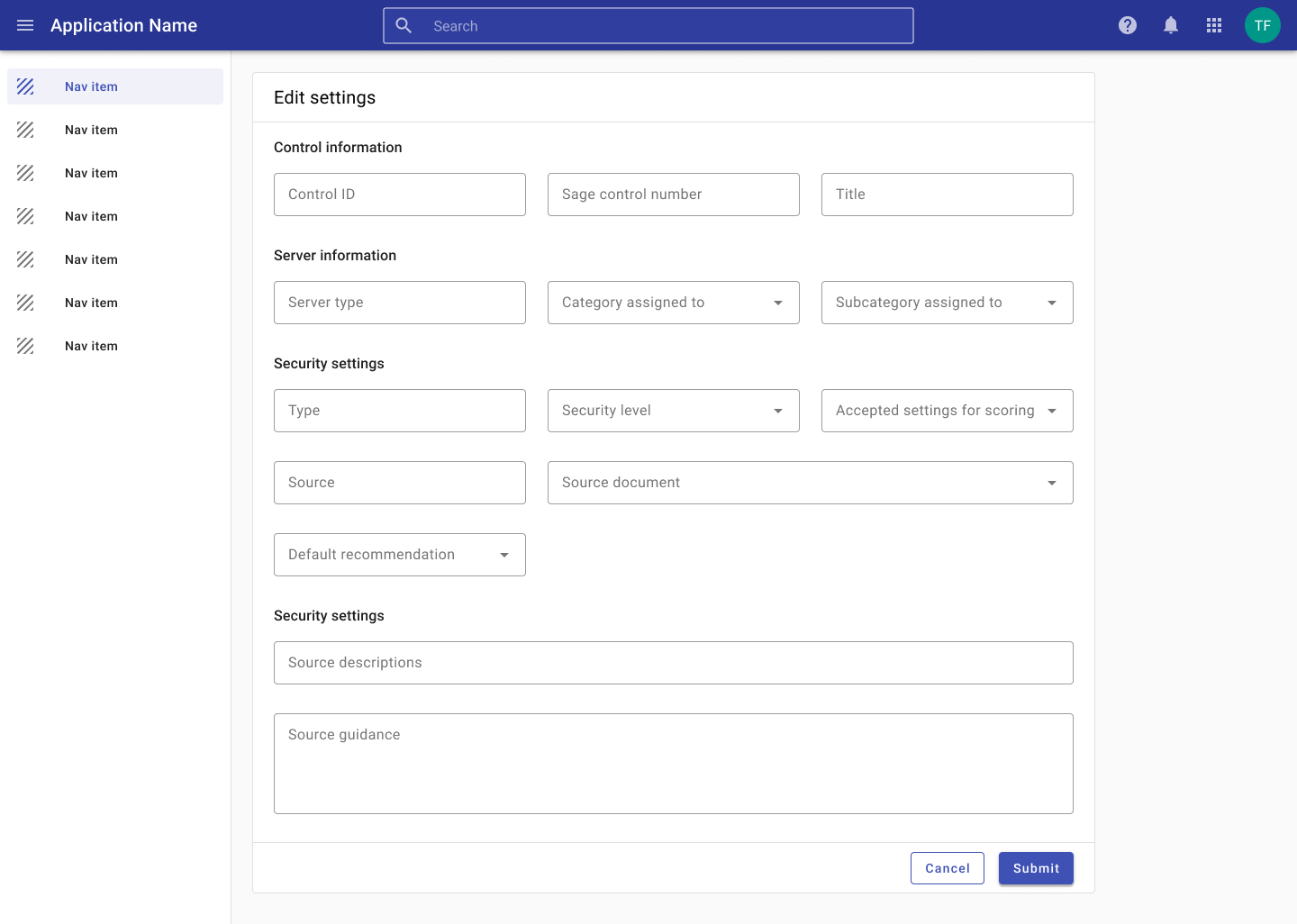
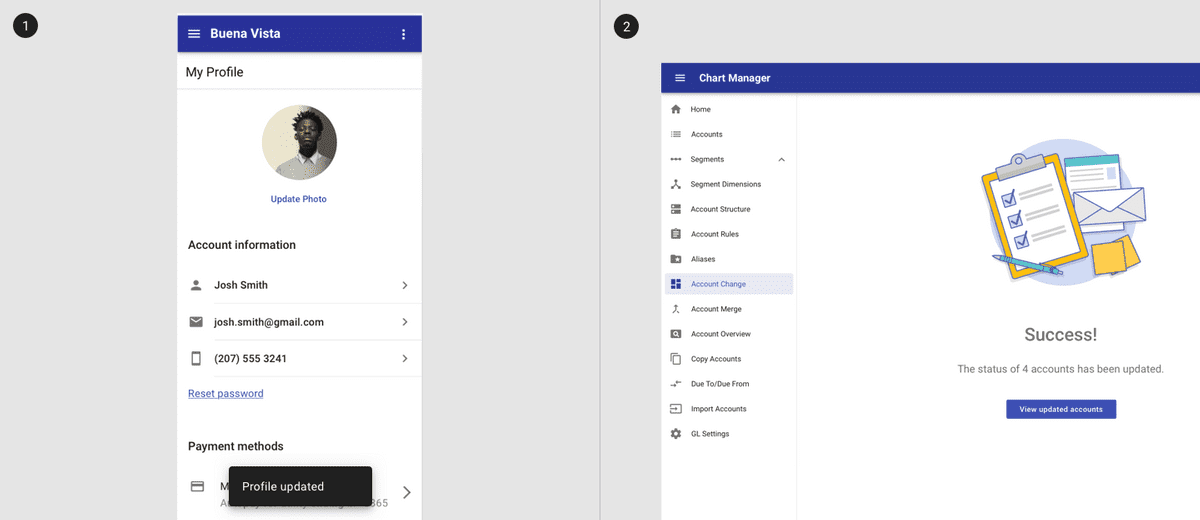
Forms may be displayed in a full screen dialog with options to save and cancel. A full page offers more space for longer forms.
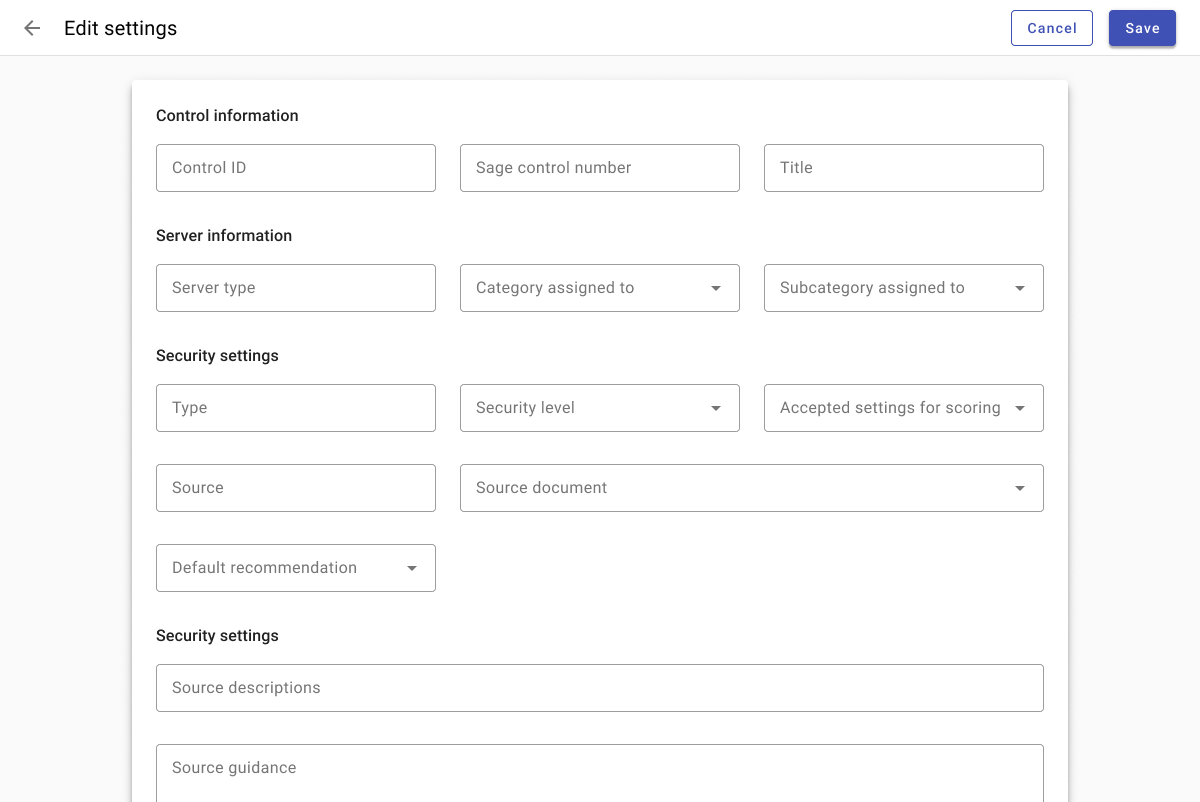
Shorter forms may be displayed in a dialog with a header and actions in the footer.
2. Content
Design principles
- Organize and group related information.
- Use a predictable column grid to keep forms manageable.
- Promote readability with a max-width as needed.
- Consider adaptive design when designing multi column forms (and see examples below.
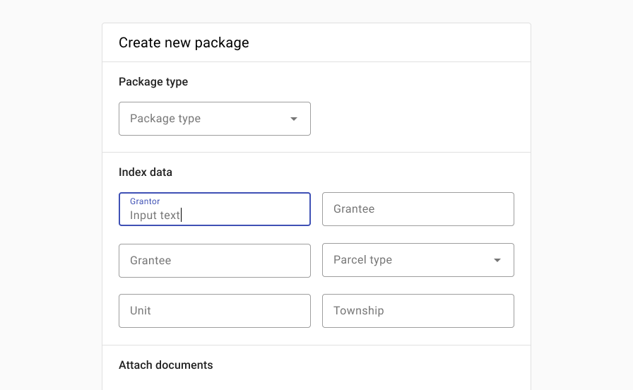
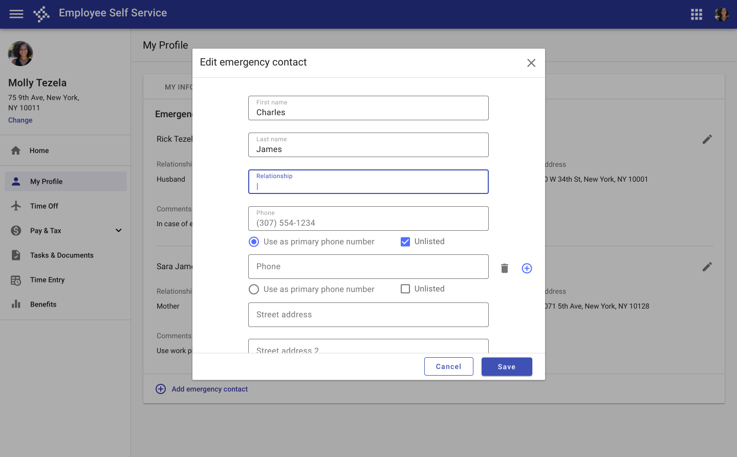
Group related content and use columns and section titles to organize content and improve readability.
3. Actions
Design principles
- Use visual weighting to highlight primary actions.
- Present clear options.
- Allow users to save changes if appropriate.
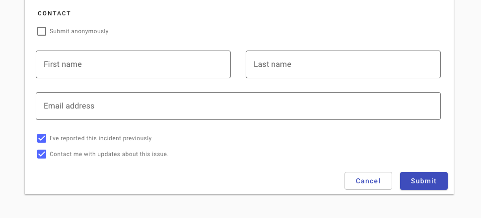
Do use a higher visual emphasis for primary actions.
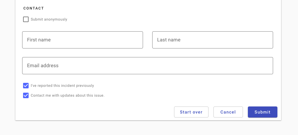
In general, provide users with the two most likely actions. Avoid potentially overlapping actions (“start over” and “cancel”).
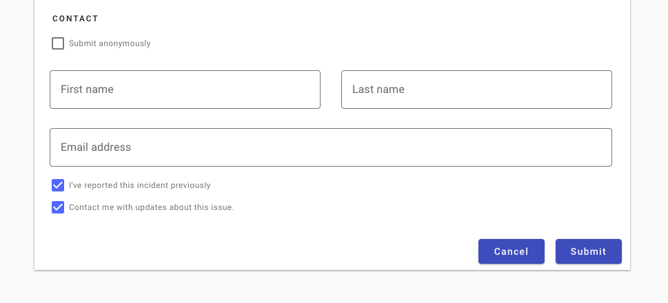

Don’t use two raised buttons next to each other in a form. It inappropriately communicates the same visual emphasis for actions that are unequally likely.
Don’t use two raised buttons next to each other, even if only one has the primary background color.
4. Submission
Design principles
- Provide feedback that a submission was successful.
- Use a conversational and friendly tone.
Components to use
| Component | Intent | Tradeoff |
|---|---|---|
| Full-screen confirmation | Uses all available screen space to verify submission. | Lacks a contextual anchor. |
| Dialog confirmation | Use originating screen as contextual anchor. | Subsequent navigation less clear. |
| Toast | Non interruptive and facilitates multi-record entry. | Transient and may be missed. |

Confirmation displayed as a full page on mobile.
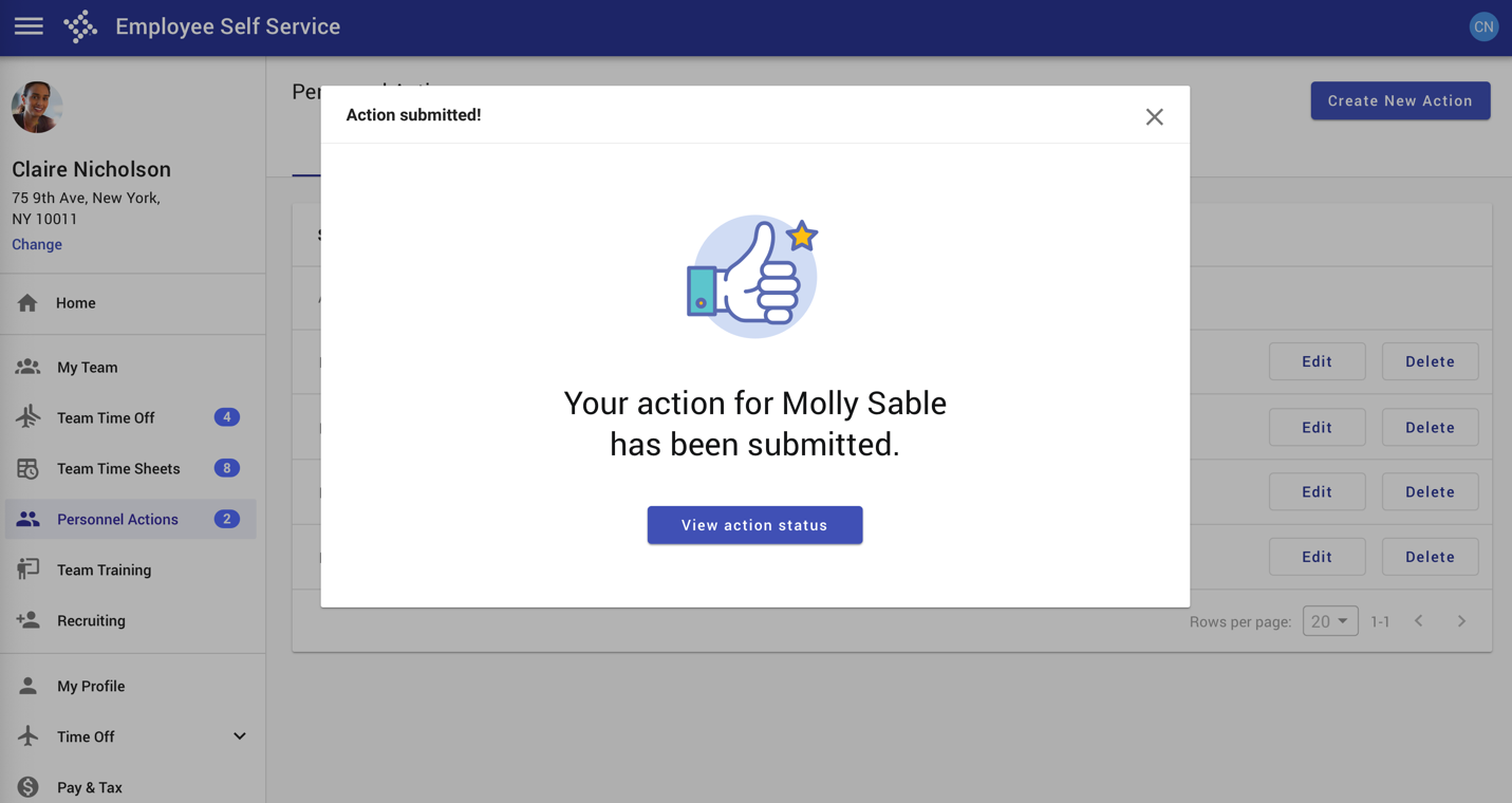
Confirmation displayed in a dialog.
5. Unsaved changes
Design principles
- Prevent data loss by prompting users to save their changes if they navigate away.
1. Form submission may be confirmed with a toast.
2. Form submission may also be confirmed with a full page or dialog confirmation pattern.
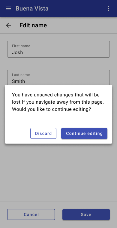
Warn users they’ll lose their data if they attempt to navigate away without saving.
Responsive
Desktop
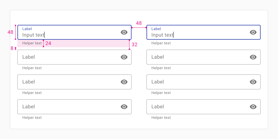
Horizontal
Use this layout when inputs are grouped in a way that encourages users to read or tab horizontally.
When a screen is sized down, fields should wrap accordingly.
Use dense inputs, 8px of vertical spacing between inputs (32px between inputs without helper text), and 24px of horizontal spacing between columns.)
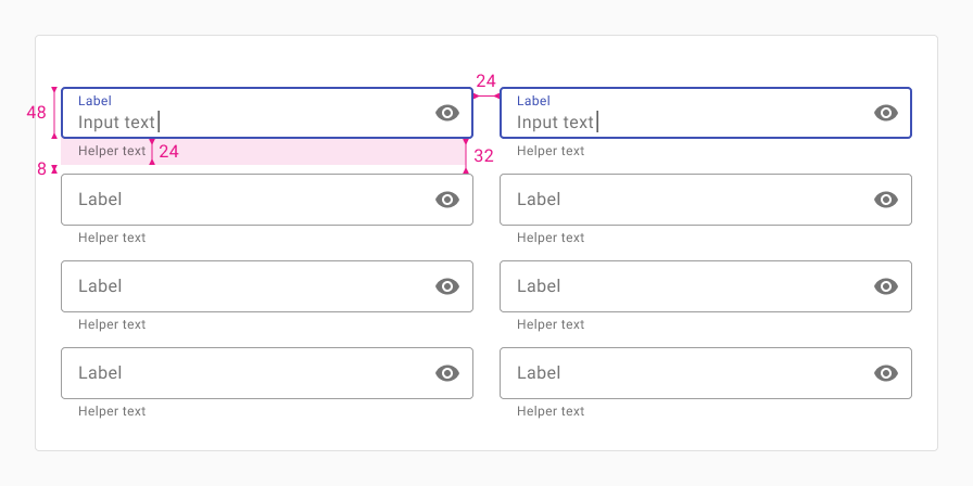
Vertical
Use this layout when inputs are grouped in a way that encourages users to read or tab down vertically, one column at a time.
When a screen is sized down, columns should stack on top of each other.
Use dense inputs, 8px of vertical spacing between inputs (32px between inputs without helper text), and 48px of horizontal spacing between columns.
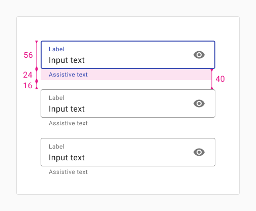
Mobile
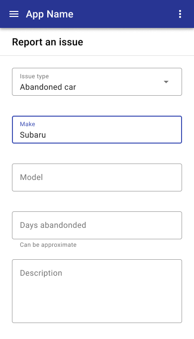
In portrait mobile mode, fields should be full width and stack vertically.
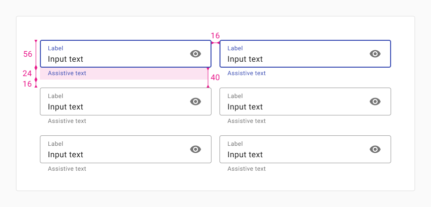
Portrait
Use this layout when inputs are grouped in a way that encourages users to read down vertically, one column at a time. Use this for tablet or portrait mobile sizes.
When tablet screens are rotated to portrait mode, fields should wrap accordingly.
Use roomy inputs, and 16px of vertical space between inputs (40px between inputs without helper text) and 32px of horizontal spacing between columns.
For traditional phone sizes in portrait mode (screen width between 350px and 480px) fields should be full width and stack vertically.
Landscape
Use this layout when inputs are grouped in a way that encourages users to read across horizontally. Use this for tablet or portrait mobile sizes.
When tablet screens are rotated to portrait mode, fields should wrap accordingly.
Use roomy inputs, and 16px of vertical space between inputs (40px between inputs without helper text) and 16px of horizontal spacing between columns.
For traditional phone sizes in portrait mode (screen width between 350px and 480px) fields should be full width and stack vertically.
Related
Forms are composed of the following components:
Forms are related to the following patterns:
- Edit, save, publish (Coming soon!)
- Layout - max width
- Progress & loading
- System communication
- Modality