Page Layouts
Clear layouts allow users to understand and navigate content quickly and easily. Use these guidelines to create intuitive web layouts.
Overview
Consistent page layouts across Tyler apps create consistency and predictability across applications and provide for standardized breakpoints.
Tyler Forge provides default page layouts to ensure consistency between apps.
- Desktop layouts: Figma file
Types
Pages should be be laid out in predictable ways depending on what kind of navigation they use. There are three main layouts:
- With a lefthand drawer (navigation or filters)
- With a lefthand drawer and right side sheet
- With top tabs
- With detail tabs
- With no navigation
1. Lefthand drawer
Page layouts with a lefthand drawer (either navigation or filters on the left) should contain:
- App bar with hamburger menu icon
- Page title in a toolbar
- Main content
- Lefthand navigation drawer filters
- A background color of #fafafa
Desktop
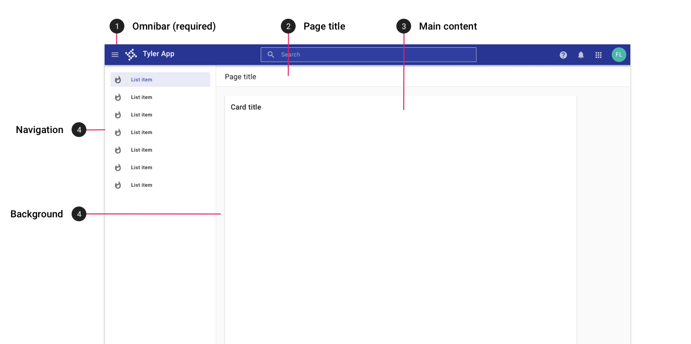
Desktop layout for an app with a lefthand navigation.
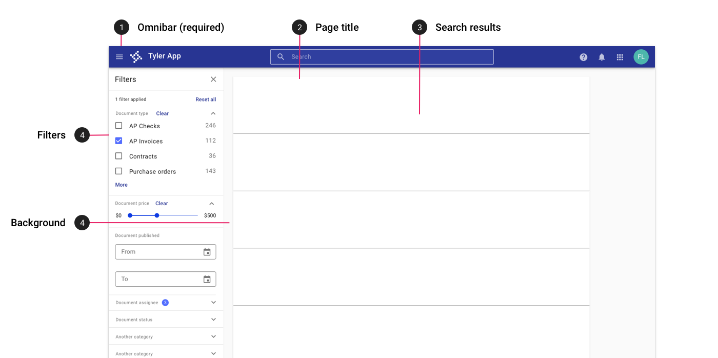
Desktop layout for an app with filters in a left drawer.
Tablet
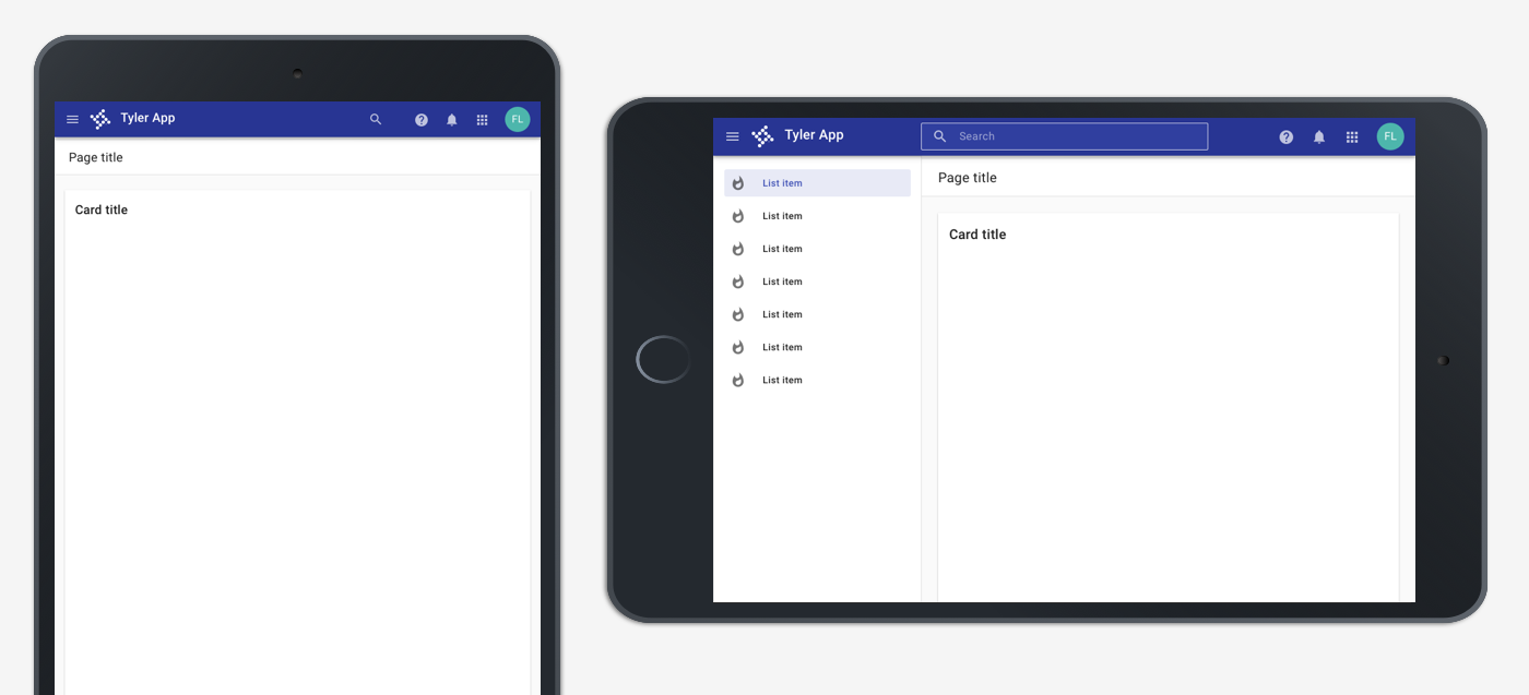
On tablet portrait, the lefthand navigation is closed by default and may be accessed by tapping the hamburger icon in the app bar. In landscape mode, the navigation is open by default; the hambuger menu may be tapped to dismiss the menu.
Mobile
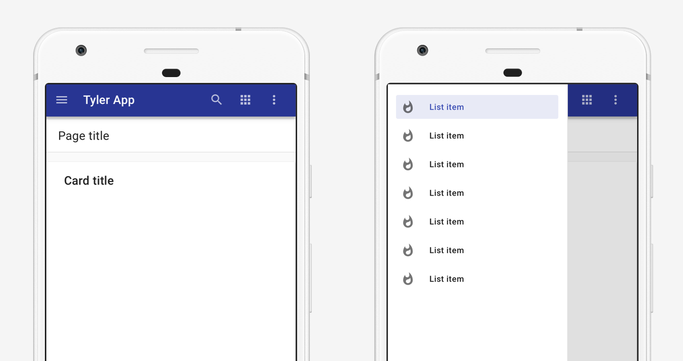
On mobile, the lefthand is closed by default. It is accessed by tapping the hamburger menu and displays with a scrim behind the other app content.
2. Lefthand drawer and sidesheet
Layouts using a lefthand drawer may also use a righthand sidesheet for filters or detail information. If dismissible, the sidesheet is toggled by an icon (use 'filter' for filters or an appropriate icon for detail information).
- App bar with hamburger menu icon
- Page title in a toolbar
- Main content
- Lefthand navigation drawer filters
- Sidesheet toggle icon
- Sidesheet
- Background color of #fafafa
Desktop
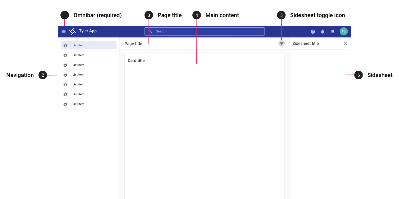
On desktop, a right sidesheet may be displayed in addition to a lefthand navigation to display detail content or filters.
Tablet
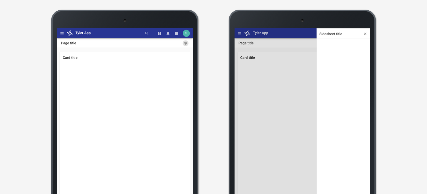
On tablet, both the navigation and sidesheet are closed by default. The navigation may be accessed by tapping the hambugerge menu; the sidesheet may be accessed by tapping the sidesheet toggle icon.
Mobile
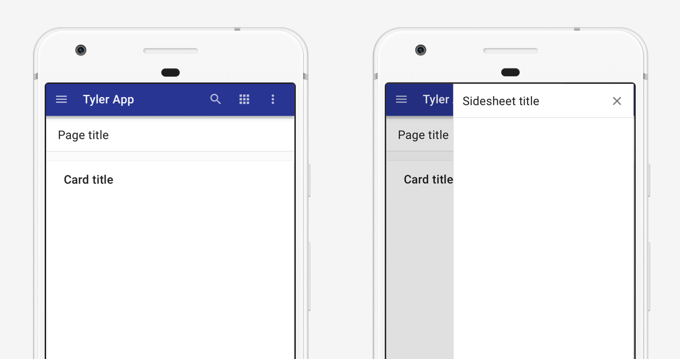
On mobile, both the navigation and sidesheet are closed by default. The navigation may be accessed by tapping the hambugerge menu; the sidesheet may be accessed by tapping the sidesheet toggle icon. The sidesheet opens with a scrim over the page content.
3. With top tabs
Apps with fewer than five primary destinations should use top tabs. Learn more. These layouts should contain:
- App bar
- Top navigation
- Main content with title
- Background color of #fafafa
Desktop
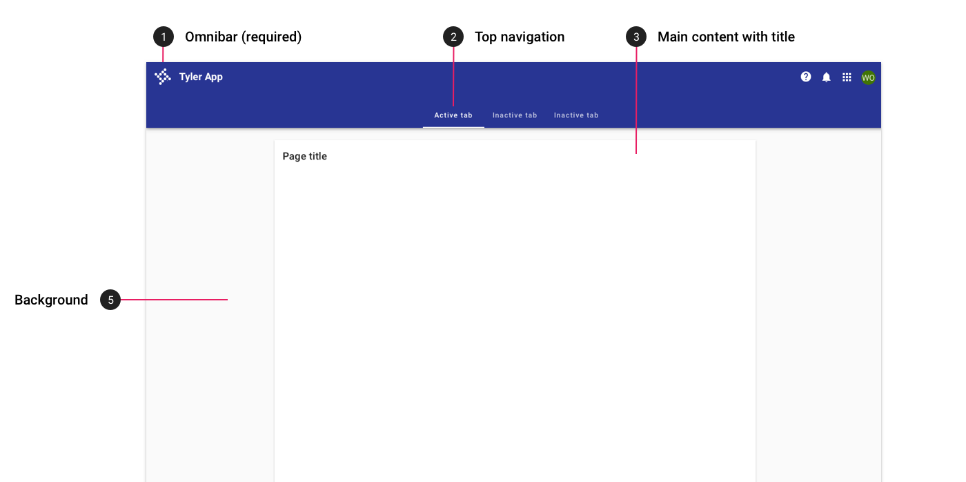
On desktop, top tabs are used for apps with fewer than five primary destinations.
Tablet
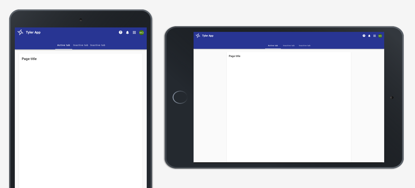
On tablet, top tabs are displayed in the app bar. Tabs may overflow horizontally, accessible by swiping left.
Mobile
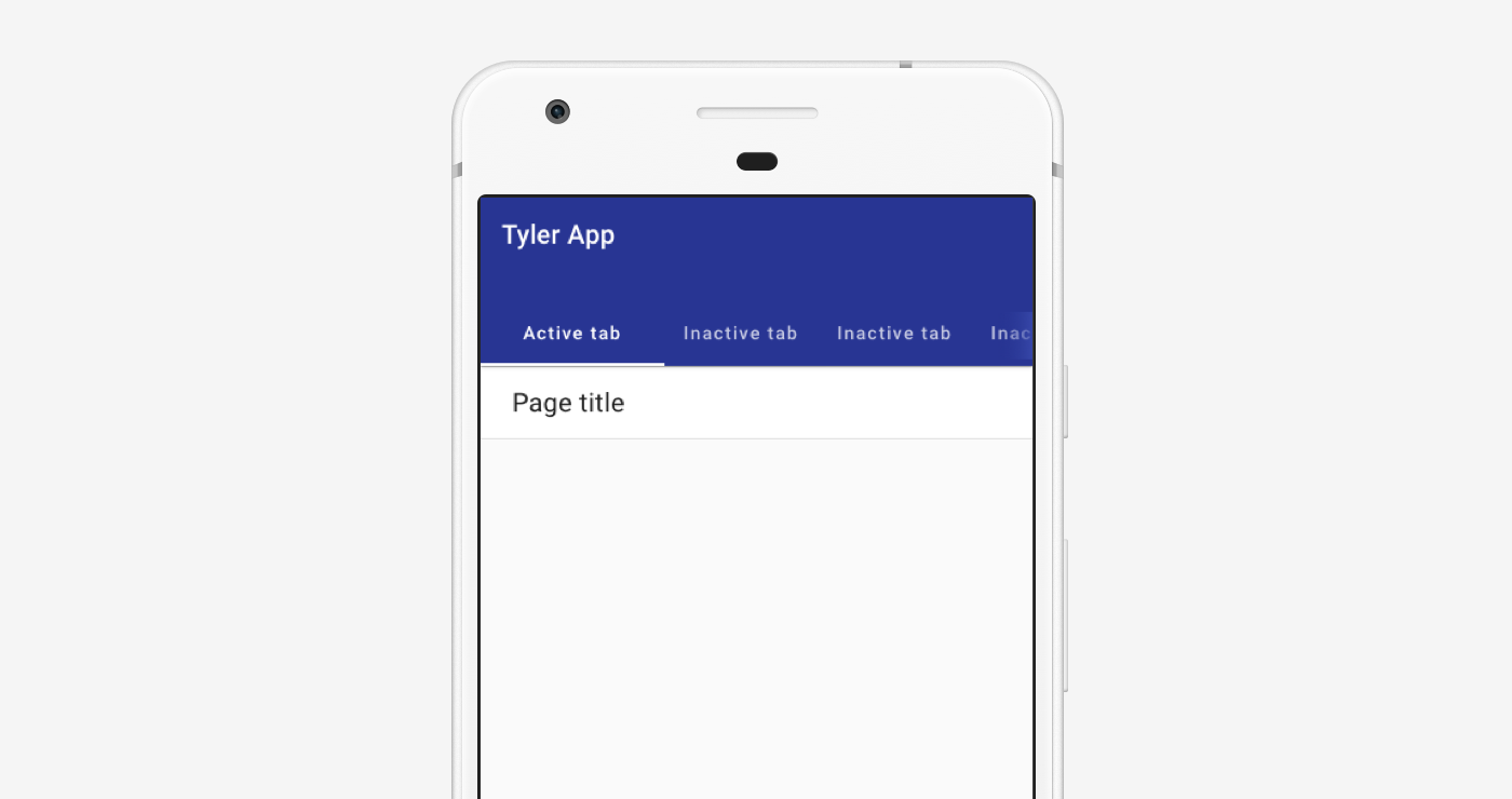
On mobile, top tabs are displayed in the app bar. Tabs may overflow horizontally, accessible by swiping left.
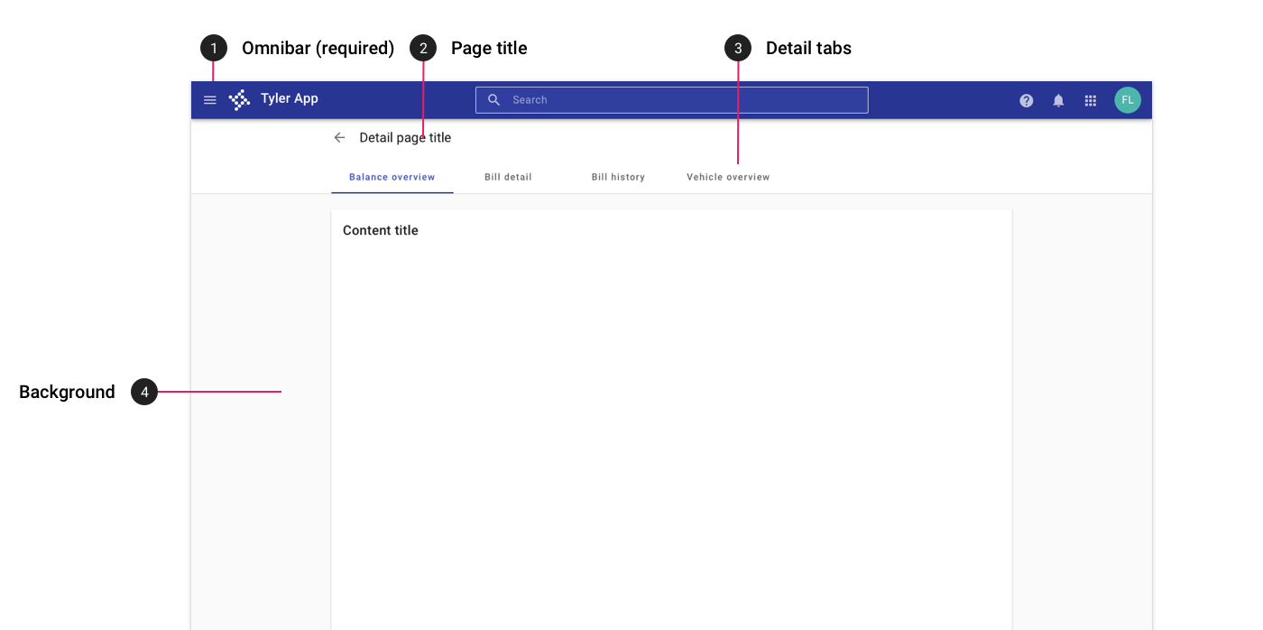
4. With detail tabs
Apps that navigate to a detail page with sub-tabs may use tabs within a toolbar. These layouts should contain:
- App bar
- Page title (aligned with main page content)
- Detail tabs (aligned with main page content)
- Background color of #fafafa
Desktop
On desktop, apps with detail tabs display title and tab text that is left aligned with the main content.
Tablet
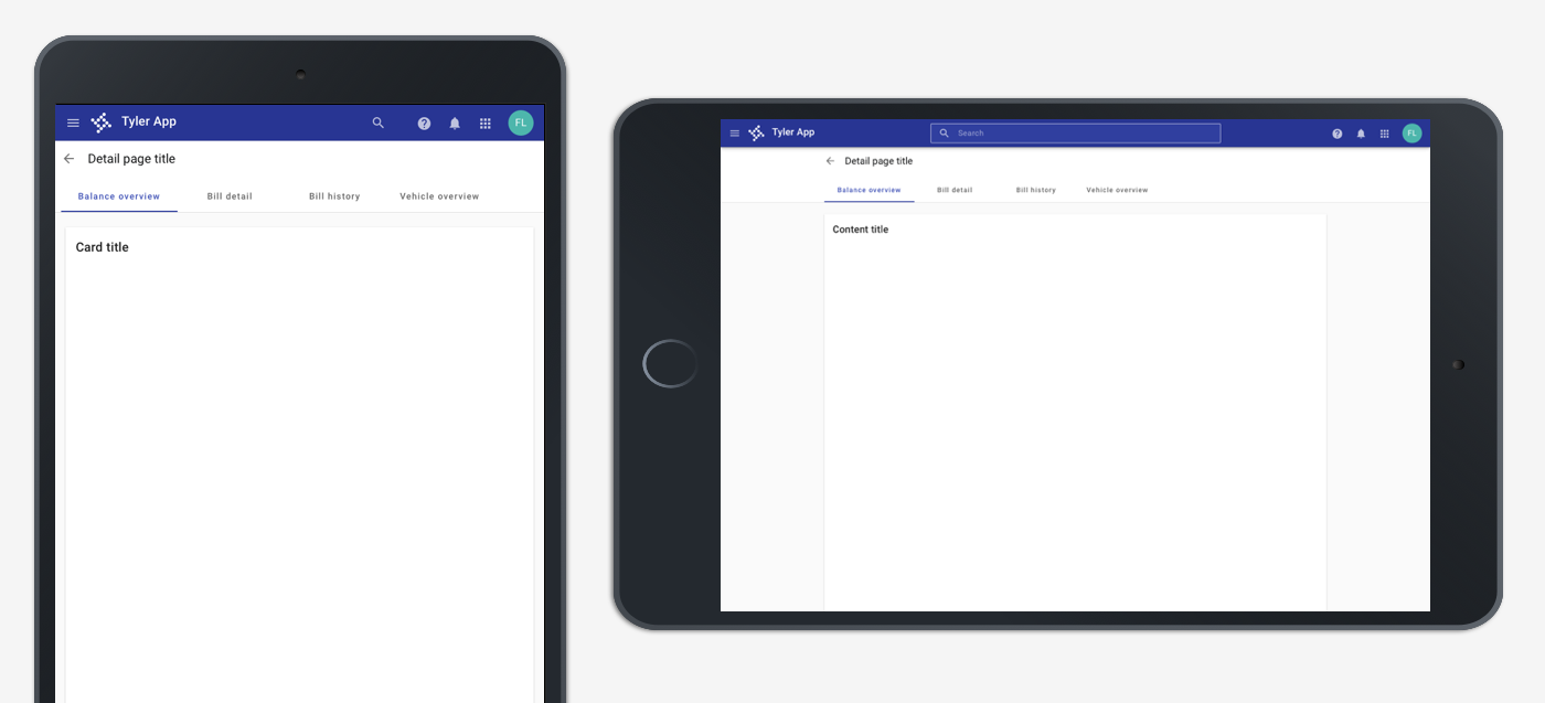
On tablet, apps with detail tabs display title and tab text that is left aligned with the main content.
Mobile
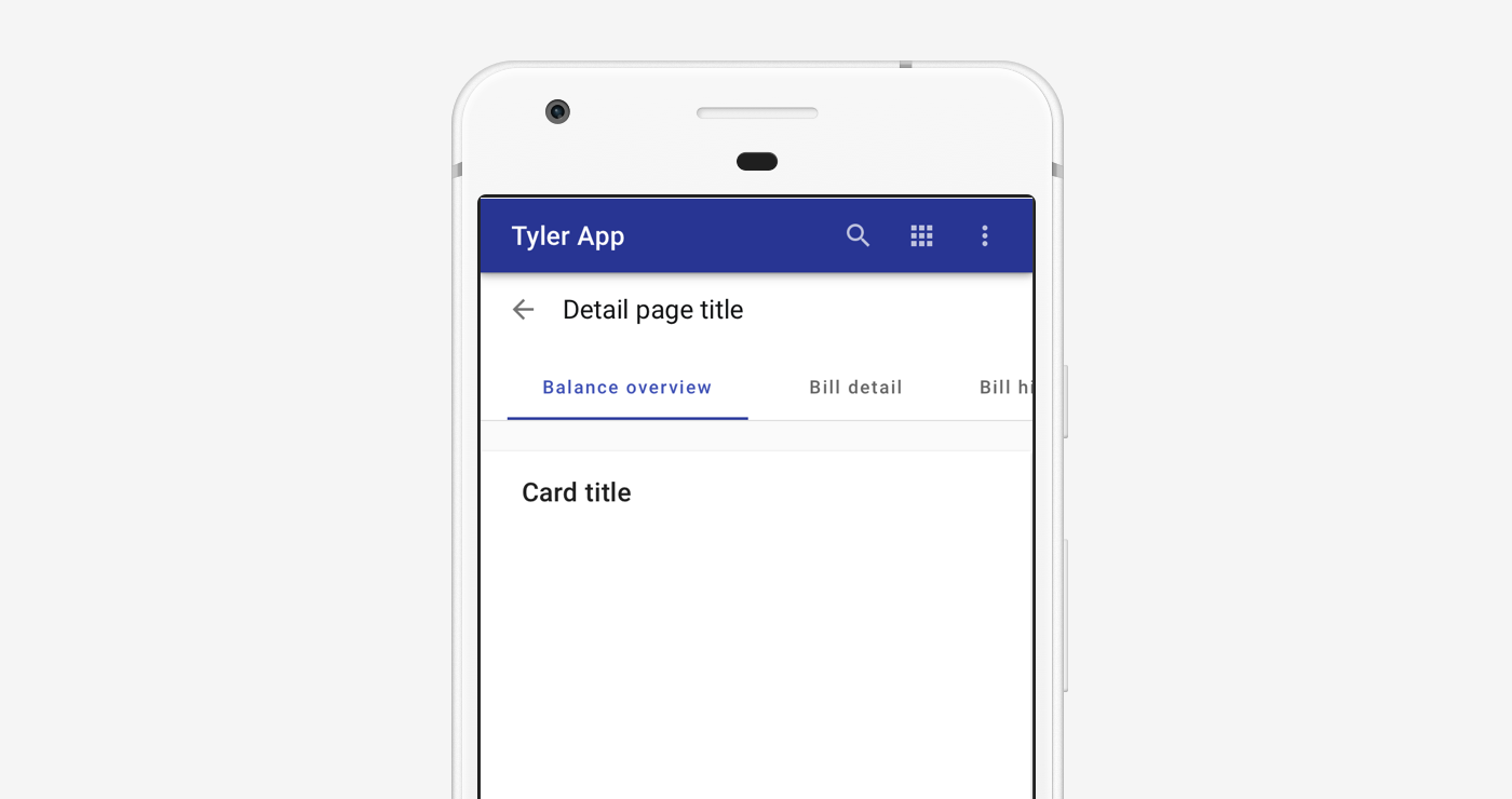
On mobile, apps with detail tabs display title and tab text that is left aligned the app title in the app bar. Tabs may scroll horizontally off screen.
5. No navigation
Single page apps with no navigation should use a centered card with a max width to display their content.
These layouts contain:
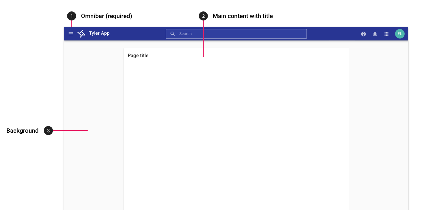
- App bar with no hamburger menu icon.
- Main content on a card with a title, centered and using an appropriate max width.
- A background color of #fafafa.
Desktop
On desktop, apps with no navigation display content on a centered card.
Tablet
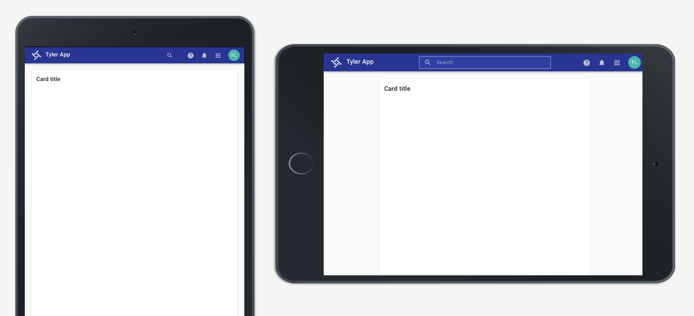
On tablet, apps with no navigation display content on a centered card.
Mobile
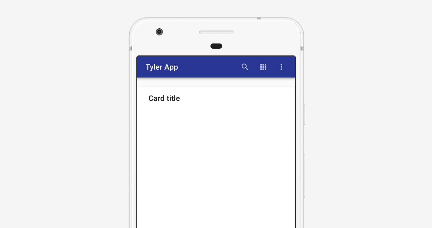
On mobile, apps with no navigation display content on a centered card.