Get started with Tyler Forge™
What is Tyler Forge?
Tyler Forge is a comprehensive design system and component library that provides a unified set of design principles, components, patterns, and guidelines to ensure consistency, accessibility, and usability across applications. Originally developed by Tyler Technologies, Forge is now available as an open-source design system.
Forge serves as the foundation for creating cohesive user experiences that feel familiar and intuitive to users. By providing standardized components and patterns, Forge enables development teams to build applications more efficiently while maintaining high design quality.
Who should use Tyler Forge?
Tyler Forge is designed for teams building modern web applications:
- Product teams developing new applications
- Development teams maintaining existing software
- Design teams creating user interfaces
- UX professionals working on application experiences
- Open-source contributors extending the design system
Types of applications
Tyler Forge supports various application categories:
Workforce applications:
- Internal tools and systems used by employees and staff:
- Administrative dashboards and management systems
- Data entry and processing applications
- Internal reporting and analytics tools
- Employee-facing productivity applications
Community applications:
- Public-facing applications used by citizens and community members:
- Citizen portals and self-service applications
- Public information and transparency tools
- Community engagement platforms
- Service request and management systems
Core components
The core components serve as the visual foundation for consistency across Forge applications and represent the essential elements most applications should include.
Use these key components for "out-of-the-box" consistency across applications, ensuring users have familiar navigation and interaction patterns.
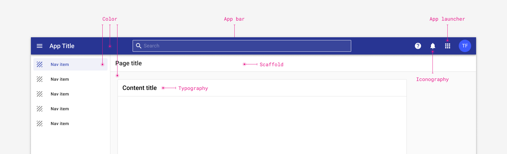
Scaffold
The foundational layout structure that provides consistent page organization across all Forge applications.
Required elements:
- App bar: Primary navigation and application identification
- Page title: Clear identification of current page or section
- Main content area: Primary application functionality and information
Optional elements:
- Navigation drawer: Secondary navigation for complex applications
- Side panels: Contextual tools or supplementary information
Benefits:
- Ensures consistent layout patterns across applications
- Provides predictable navigation structure
- Supports responsive design across different screen sizes
App bar
The app bar serves as the user's primary navigation hub, containing everything needed to navigate within the current application and access key functionality.
Key features:
- Current application identification and branding
- Primary navigation elements
- User account and profile access
- Notifications and alerts
- Settings and configuration options
- Help and support resources
App launcher
The app launcher is a navigation component that enables users to switch between different applications or sections seamlessly. Typically located within the app bar and represented by an Apps or menu icon.
Purpose:
- Provides navigation between related applications or modules
- Maintains context while allowing application switching
- Reduces friction when users need to access multiple tools
Color
Forge uses an organized approach to color application that supports brand consistency and accessibility.
Color structure:
- Brand color: Represents your organization's identity
- Primary color: Main interactive elements and key actions
- Secondary color: Supporting elements and secondary actions
- System colors: Status indicators, alerts, and feedback
Benefits:
- Maintains visual consistency across applications
- Enables flexible theming while preserving brand identity
Typography
A purposeful set of typographic styles that create clear visual hierarchy and improve readability.
Typography system
- Heading styles: Multiple levels for content organization
- Body text: Optimized for readability across different contexts
- UI text: Specialized styles for interface elements
- Display text: Prominent text for key messaging
Benefits:
- Creates clear visual patterns and user expectations
- Improves content scannability and comprehension
- Ensures consistent text treatment across applications
Iconography
Forge provides a comprehensive icon library that offers consistent visual communication across applications.
Icon categories
- Navigation icons: Wayfinding and menu elements
- Action icons: Interactive elements and user controls
- Status icons: System feedback and state indicators
- Content icons: Representing different types of information
Benefits:
- Establishes clear visual language and brand expression
- Improves user interface comprehension and usability
- Reduces cognitive load through familiar symbol recognition