Text field
Overview
Text fields allow users to enter text into a UI. They typically appear in forms and dialogs.
Parts
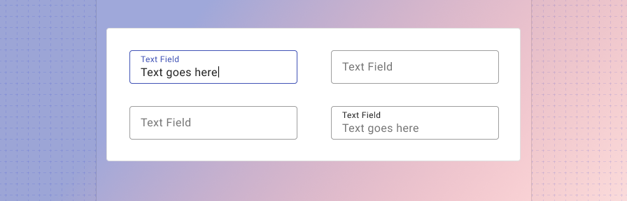
Text fields are comprised of four parts: 1. Label (required) 2. Input (required) 3. Helper text (optional) 4. Character counter (optional).

1. Label
Label text is used to inform users as to what information is requested for a text field. Every text field should have a label.
Label text should be aligned with the input line, and always visible. Text fields may use a fixed label or a floating label.


Use succinct, natural language and consistent capitalization.
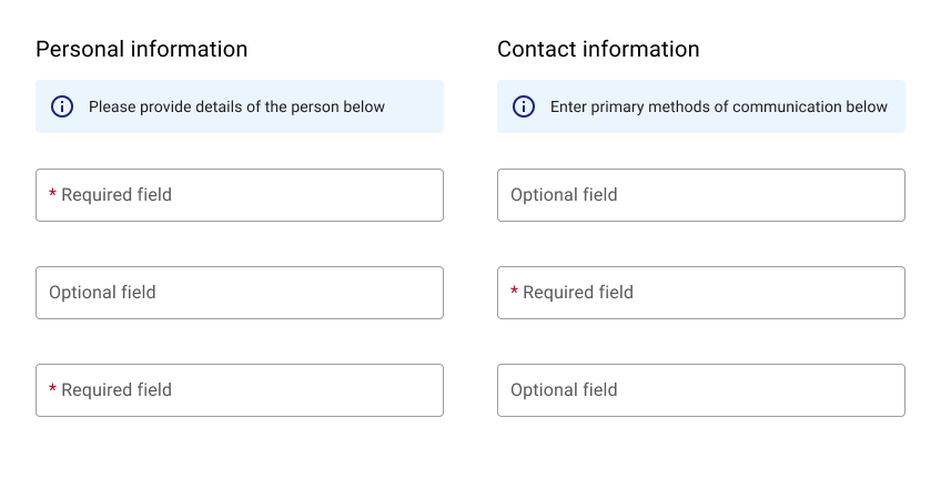
If most fields are optional, indicate which are required using an asterisk.
If most fields are required, indicate which are optional with “(Optional).”
2. Input
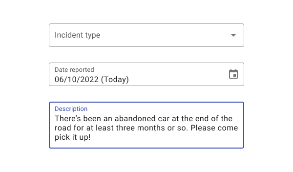
The input allows a user to enter text or data. Use format masking for date, email, and currency fields.


The length of input fields should reflect their expected content.
Use auto-formatting for fields such as phone number and credit card number to reduce validation errors and format uncertainty. Constrain data inputs such as phone numbers and credit card numbers to numbers only.
Ensure that inputs grow with text as appropriate. Use a textarea control to accommodate longer text entry.


Use caption text above a text input to display longer labels, such as survey questions or application prompts.
Don’t cut off text by using a field that’s too small for the intended input.
Defaults
Defaults can save users time and effort. Use defaults whenever reasonable predictions about users’ goals can be made. When using radio buttons, provide a default selected option if possible.

Default in today’s date when applicable.
Placeholder text
Where possible, use helper text below a field instead of placeholder text. According to Norman Nielsen, placeholder text can pose issues because of its transitory nature and can make it difficult for users to remember what information belongs in a field.


When using placeholder text, ensure that the label floats persistently.
If you need to provide additional information to users, consider using helper text instead of placeholder text where possible. In the above example, “ie, todd@example.com” could displayed as helper text instead. When using placeholder text, ensure that the label floats persistently.
Don’t use placeholder text as a label. Since placeholder text disappears on user input, use a label element to ensure that the field label persists.
3. Helper text (optional)
Helper text conveys additional guidance about the input field, such as how it will be used. It should only take up a single line, being persistently visible or visible only on focus.
Validation
Error text ensures the data submitted by the user conforms to acceptable parameters.


Provide actionable remedies that will help users enter correct information ("Enter a valid email, using the format: address@domain.com.") If only one error is possible, error text describes how to avoid the error. If multiple errors are possible, error text describes how to avoid the most likely error.
Validate information before a user has entered information. Validate when a user leaves a field.
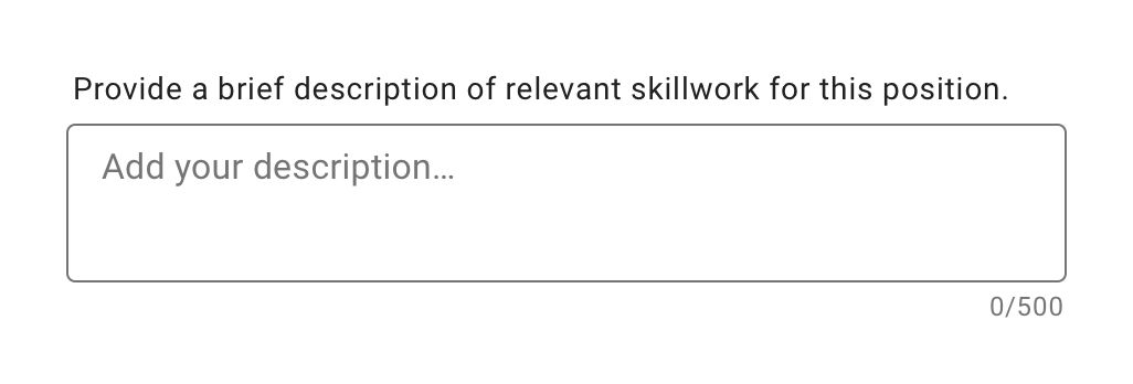
4. Character counter (optional)
Character or word counters should be used if there is a character or word limit. They display the ratio of characters used and the total character limit. They should only be used when a strict character count is enforced.
5. Required fields
To indicate that a field is required, display an asterisk (*) next to the label text and mention near the form that asterisks indicate required fields.
- If some fields are required, indicate all required ones
- If most fields are required, indicate optional fields by displaying the word “optional” in parentheses next to the label text
- If required text is colored, that color should also be used for the asterisk
Types
Text fields can display user input in the following ways: 1. Single line text fields 2.Multi-line text 3. Text-areas 4. Read only fields.
1. Single-line text fields
Singe-line fields display one line of text.
As the cursor reaches the right field edge, text longer than the input line automatically scrolls left. Single-line fields are not suitable for collecting long responses. For those, use a multi-line text field or text area instead.
2. Multi-line text fields
Multi-line text fields show all user input at once. Overflow text causes the text field to expand (shifting screen elements downward), and text wraps onto a new line These fields initially appear as single-line fields, which is useful for compact layouts that need to be able to accomodate large amounts of text.
3. Textareas
Text areas are taller than text fields and wrap overflow text onto a new line. They are a fixed height and scroll vertically when the cursor reaches the bottom of the field. The large initial size indicates that longer responses are possible and encouraged. These should be used instead of multi-line fields on the web. Ensure the height of a text area fits within mobile screen sizes.
4. Readonly data
Use a label-value pairs to show text fields that currently aren't editable. Avoid using disabled fields when possible, as their light color can cause legibility issues.
5. Questionnaire text
For text fields with a question-like label, display text above the input and use the body2 class to improve legibility.
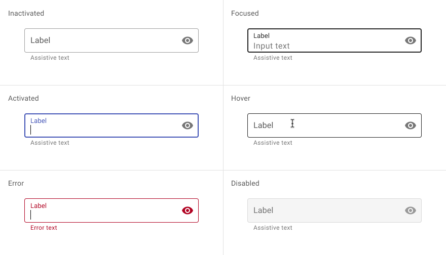
States
Text fields may have the following states: 1. Inactive, 2. Focused, 3. Activated, 4. Hover, 5. Error, 6. Disabled.
Best practices
Swap helper text with error text.
Group required fields together.
Limit the number of tabs on mobile.
Text field length should match the expected input length. Otherwise, use a consistent length that provides enough room for appropriate inputs.
Don’t truncate long label text.
Label text shouldn’t wrap to two lines.
Don’t place error text under helper text, as their appearance will shift content.
Related
Components
Text fields can be used in:
Instead of disabled text fields, consider
Patterns
Coming soon!