Drawer

Overview
Drawers are used to support supplementary information on the left and right side of a screen.
Drawer types
There are four types of drawers: permanent, dismissible, modal, and mini.
1. Permanent
Recommended for desktop. Persistently visible and pinned to the edge, at the same elevation as the content or background.
2. Dismissible
Recommended for desktop. Visible by default and pinned to the edge, at the same elevation as the content or background.
3. Modal
Recommended to be used in combination with a dismissible drawer, where the dismissible drawer is used at desktop sizes and the modal drawer is used at tablet and mobile sizes.
4. Mini
Recommended for desktop when the main content is extra wide.
Variations
Drawers can be used to support different types of content: 1. Navigation drawers 2. Filter sidesheets 3. Detail panels
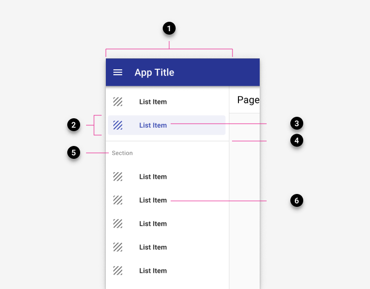
1. Navigation drawer
Display on the left by default. Learn more about navigation drawers.
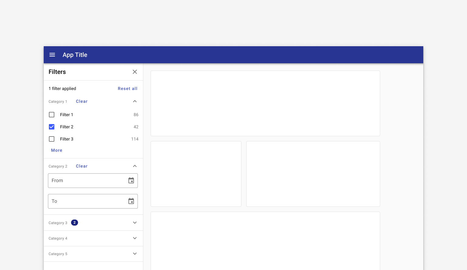
2. Filter sidesheet
May display on the left or right. Learn more about filter sidesheets.
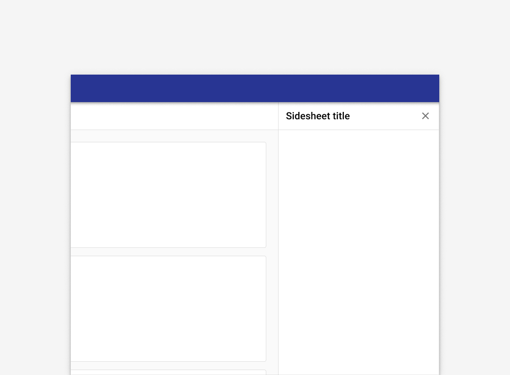
3. Detail panel
A detail panel may show addiitonal information about a record or section. Detail panels generally display to the right on desktop and display as an overlay from the right on mobile devices.
Related
Components
The navigation drawer is used with:
For apps with fewer than five primary destinations, use:
- Tabs instead.