Tabs
Overview
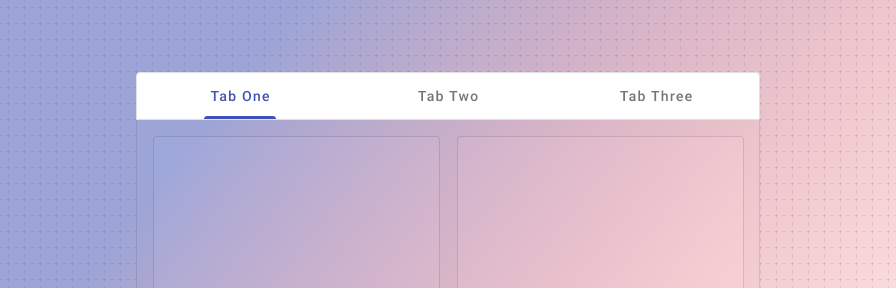
Tabs are used to group different but related pieces of content in one area without having to navigate to new pages. They can be used in various different locations and scenarios such as in cards, dialogs, tables, or side panels, or can also be used as navigation for an app. Tab label text should clearly and succinctly describe the content it represents while tab content should contain a cohesive set of items that share a common characteristic.
Tabs may be paired with components like the app bar, or nested in components like cards, dialogs, or sidesheets.
When to use
Sub navigation
Tabs are often found as sub navigation within a page or record and can be used on an individual section of a page to change between related content, such as in a card, on a dashboard, or in a side sheet.
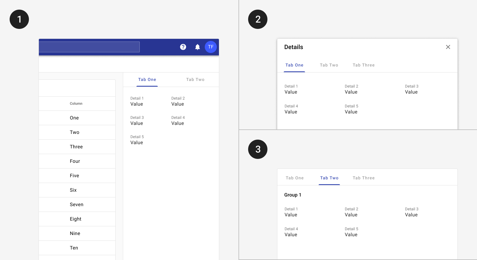
Tabs may be placed inside components such as 1) side panels, 2) dialogs, or 3) cards.
Secondary navigation
When used as secondary navigation specifically, expanders in the navigation should also be considered. Expanders can be a bit more discoverable as they’re accessible from the drawer, while a user must navigate to a detail page in order to view tabs.
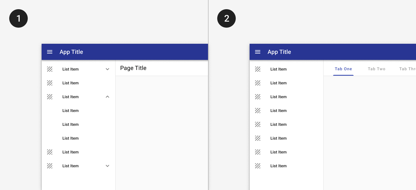
1. Expanders may be used to display pages at a second level of hierarchy.
2. Tabs may be used to show closely related content.
Primary navigation
Tabs can be used as the main navigation of an app if there are a limited amount of destinations. With this, the tabs appear in the app bar itself extending it to twice its height. If your app has more than five primary destinations, use a navigation drawer. Otherwise, tabs may be used in the app bar.
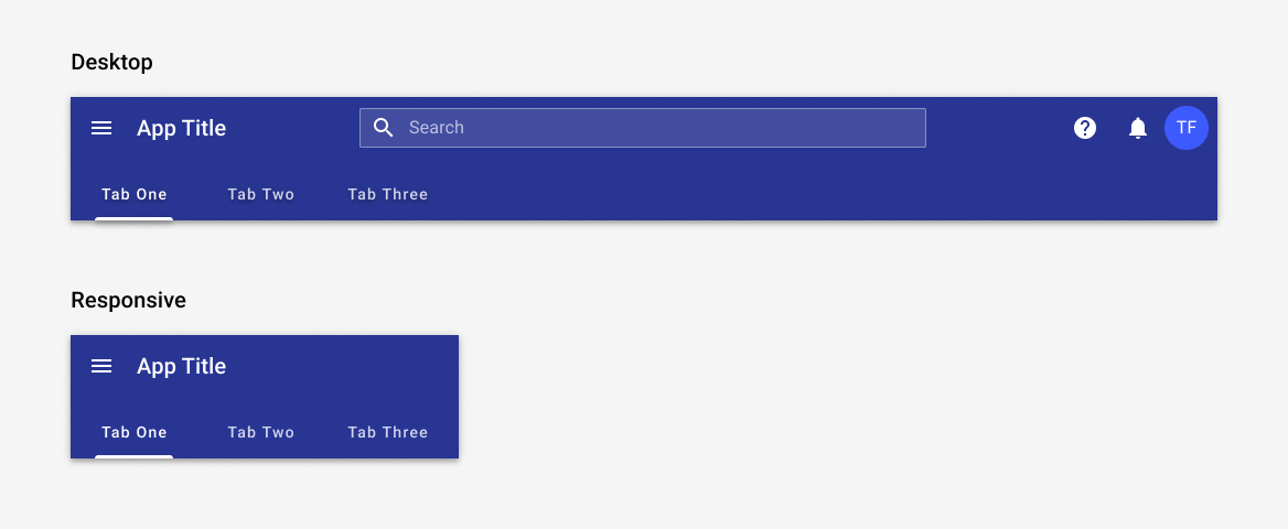
Tabs in the app bar may be used as primary navigation when there are fewer than five primary destinations.
Responsive
Tabs may scroll horizontally on mobile. The tab bar should be fixed but should allow for scrolling or swiping within it.

On mobile, tabs may continue offscreen and may be accessed by swiping. When tapped, a scrollable tab should reposition itself to become fully visible on screen.
Best practices
Tab labels may include text only, text and icons, or icons only.
Tab labels should be succinct but clear.
Limit the number of tabs on mobile.
Tabs should be placed directly above content they control.
Use caution when only representing tab content with icons, as an icon’s meaning may not be clear on every topic.
Don’t use tabs to move through sequential content that needs to be read in a particular order.
Avoid using tabs for comparing content across multiple tabs, such as different sizes of the same item.
Don’t nest tabs within tabs.
Avoid placing swipeable items in the content area of a UI that has tabs, as the user may mistakenly swipe the wrong component.


Don’t mix tabs that contain only text with tabs that contain only icons. Use either all text labels, all icon labels, or both across all labels.
Don’t truncate labels unless required, as truncated text can impede comprehension.


Don’t resize text labels to fit them onto a single line. If labels are too long, wrap text to a second line or use scrollable tabs.
Don't use the default tab height for tabs with icon and text. Use the stacked attribute to ensure the correct height.
Related
Components
- Use expansion panels to group content that needs to be compared between groups.
- Tabs may be used inside the app bar.
- Tabs may be used with dialogs, cards, or sidesheets(coming soon!).
- Page level tabs may be placed with the scaffold.