Expansion panel
Overview
Expansion panels are very useful for progressive disclosure - highlighting important details for a section and revealing additional detail as needed. Expansion panels can help focus a design and display critical information first.
An expansion panel is a lightweight container that may either stand alone or be used in a number of components including cards, navigation items, lists, and tables.
States
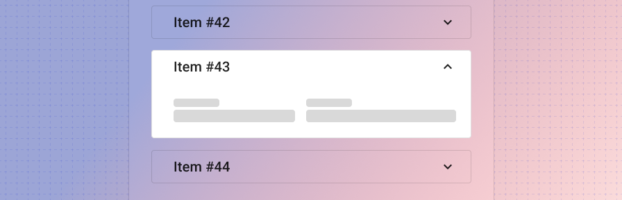
Collapsed
Display summary data and an expansion icon to indicate that the user may tap for more information.
The expansion panel should include a focus and hover state to indicate that it can be interacted with. In its collapsed state, the full line item should be clickable in order to expand the content, not just the expand icon. Ensure that you're using using appropriate touch target spacing (at least 48 x 48px).
The expand icon-button may be placed either before the panel text or after it.
Open
Display additional information within the expanded section. Persist the summary top level data when the element has been expanded.
If one section is expanded and another section is open, we recommend leaving multiple panels open unless there's a compelling case to only allow for one open panel at a time (in the case of editing, for example).
Types
In a list
In a card
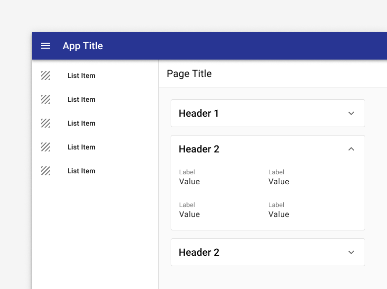
Use a an expansion panel to display additional info in a card.
In a table
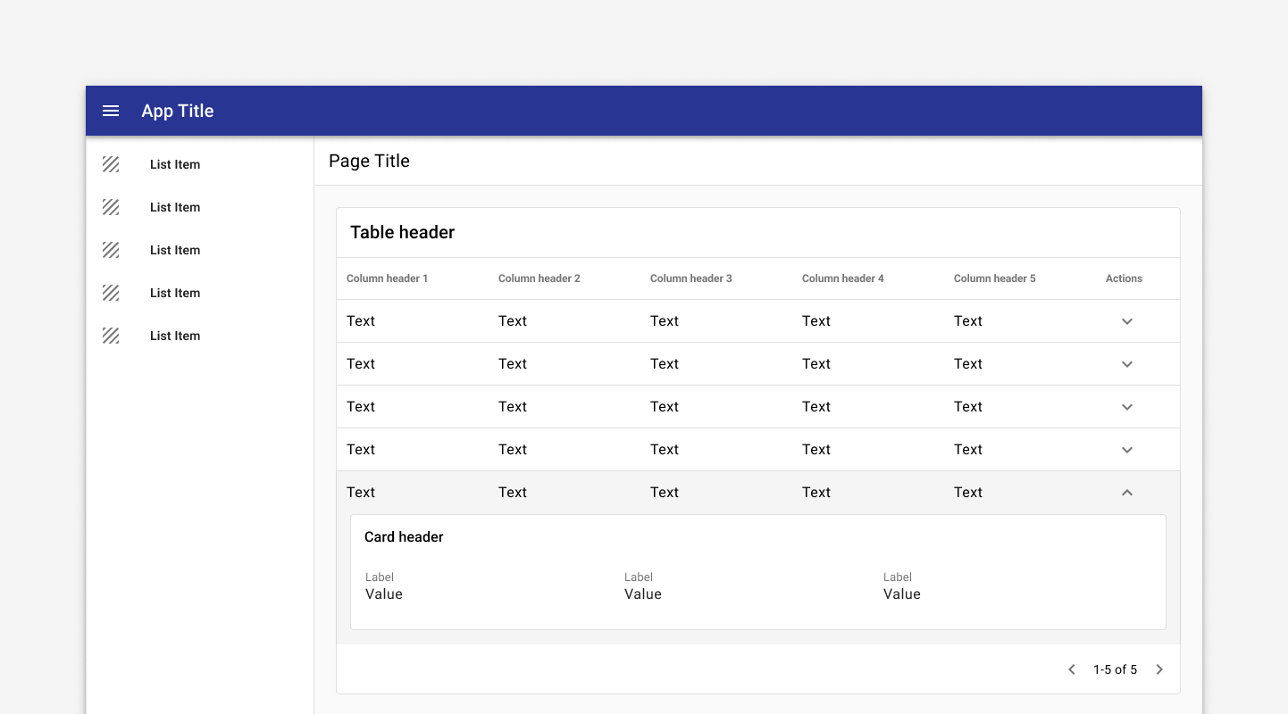
Tables may use expandable rows to display additional content.
In a navigation drawer
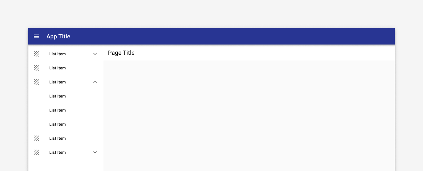
Use an expansion panel to display parent and children items in a nav drawer.
As a task card
Ensure that the expansion icon remains persistent to facilitate easy toggling for opening and closing.
Ensure that the full panel is clickable, not just the expansion icon, to facilitate tap interactions. Ensure that the panel has the appropriate focus and hover states.
Be careful when using editing with expansion panels. In general a dialog or full detail page are better for editing, but if you must use editing within an expansion panel, ensure that only one panel can stay open at a time and that the user is prompted to save their changes if they move away from the active panel.
Related
Components
Expansion panels may be used with:
Patterns
Coming soon!