Label value
Overview
The label value component is used to display readonly data that has a label and data element. They may be used with a task card or within a form that has already been submitted.
The label value component does not contain any interactive indicators such as hover states, but it is read by a screen reader.
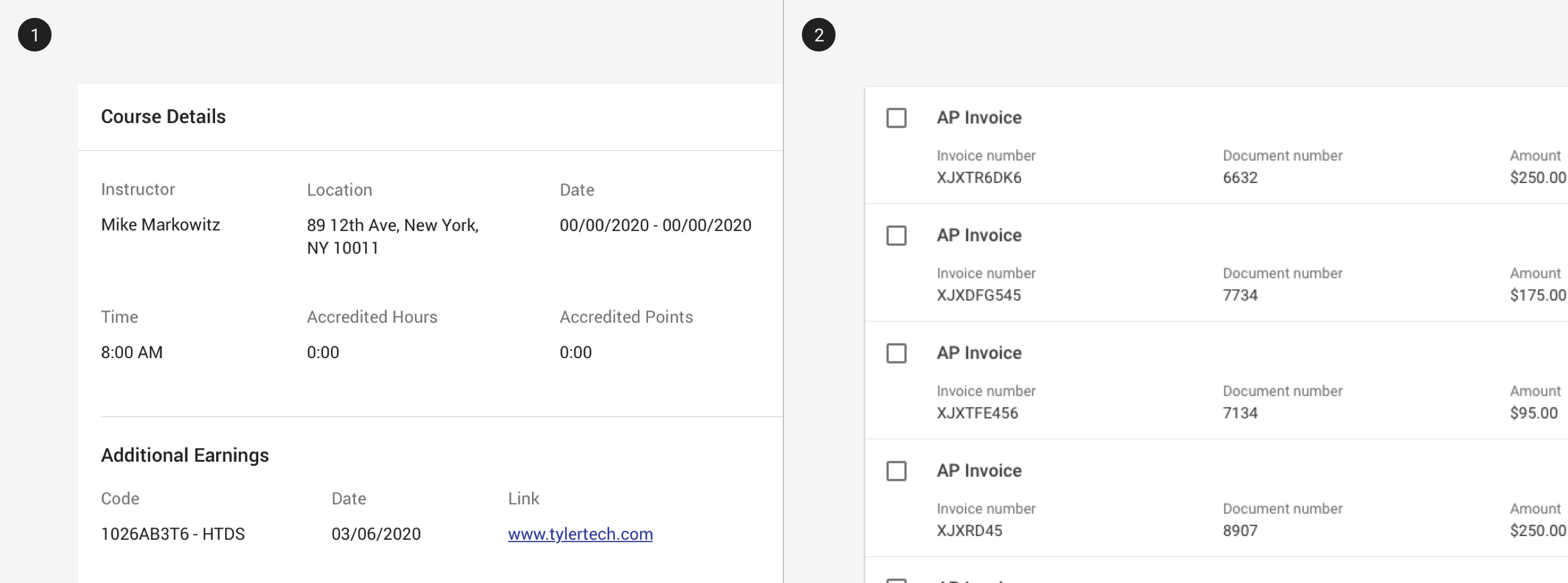
1. Label value components may used in a card.
2. Label values used in task card search results.
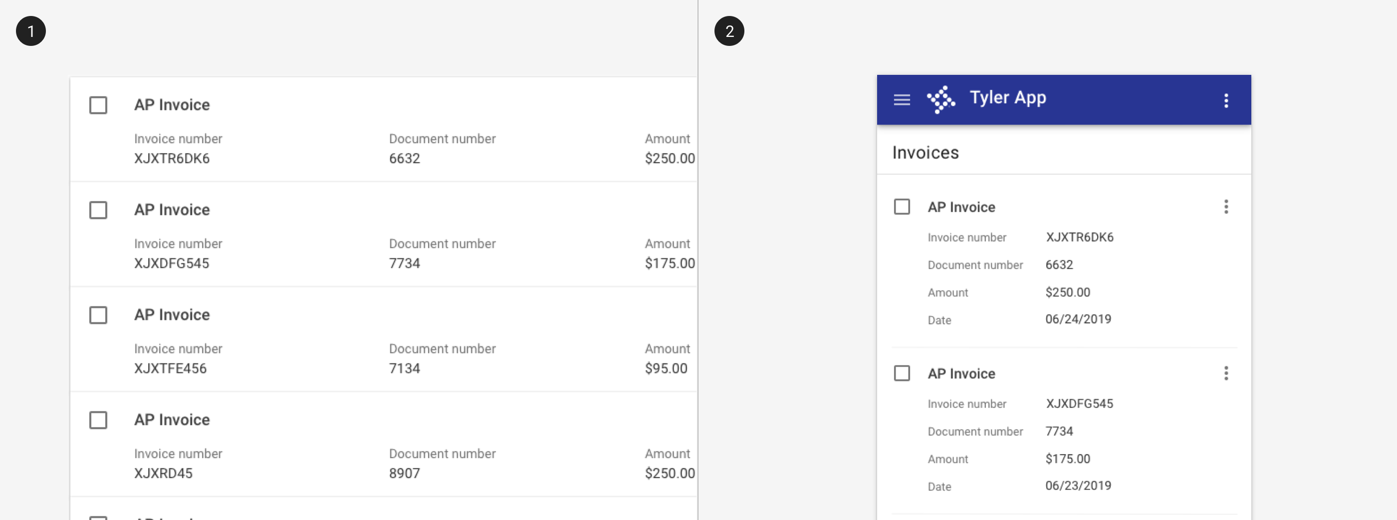
Vertical label value pairs may be translated to horizontal pairs on mobile to improve scannability.
Use when
- Displaying form fields in readonly mode.
- Displaying succinct data with labels.
Don't use when
- Displaying data with long titles. Use a list instead.
- Displaying paragraphs or text-heavy data. Use a list instead.
Readonly states
A readonly state may be used when:
- A component is active, but not editable; generally relates to a text field
- The content is still relevant or important for task completion but cannot be changed
Be sure to communicate if editing is available, and how to enable it.
Best practices
Use the label value component for values that are displayed but non interactive.
Avoid large numbers of disabled text fields on a screen - consider using the label value instead to improve readability.
Related
Components
- Label value pairs are used most frequently with cards.
Patterns
- Label value pairs frequently display data from forms. (Coming soon!)