Switch

Overview
Switches are a type of selection control. There are three types of selection controls: 1. Checkboxes, 2. Radio buttons, 3. Switches.
- Radio buttons: allow the selection of a single option from a set.
- Checkboxes: allow the selection of multiple options from a set.
- Switches: allow a selection to be turned on or off.
Switches
Switches offer binary options (on/off, true/false).
Use switches when:
- communicating that a setting will be instantly applied or changed (without the use of a "submit" button for example).
- a setting requires an on/off or show/hide function to display the results.
- a user needs to perform instantaneous actions that do not need a review or confirmation.
- a user is toggling independent features or behaviors.
Best practices
Provide clear nonneutral labels. Labels should describe what the control will do when the switch is on. When in doubt, say the label aloud and append “on/off” to the end. If it doesn’t make sense, then rewrite the label (ie, "Show week number" instead of "Include week number?").
Match label text to state of the state of the switch. Turning the switch on should not turn something off, and conversely, turning a switch off should not turn something on.
Don't use switches for settings that require additional user action, such as "Save," "Submit," "Cancel." Use a checkbox instead.
Don't use a switch for an option that has a neutral or indeterminate state. Use a checkbox instead.
Don't use switches to display multiple related options from a user must choose. Use checkboxes instead.
Don't nest switches. Use checkboxes instead in order to display an indeterminate state at the parent node.
Don't use switches in filters. Use checkboxes instead.
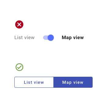
Don't use switches for opposing options. Switches should only be used for binary options; use a button toggle for opposing options.
Related
Components
- Use radio buttons to allow for the selection of a single option from a set.
- Use checkboxes to allow for the selection of multiple options from a set.
- Use a button toggle to allow for the selection of a single option from a small set.
- Use choice chips to allow for the selection of a single option from a small set, especially in mobile contexts.
- Use a select to select options when space is limited.
Patterns
- Forms (Coming soon!)
- Rich Text Editor (recommended: TinyMCE, Quill)
Resources
- Checkbox vs Toggle Switch (UX Planet)
- When to Use a Switch or Checkbox (UX Movement)
- Toggle-Switch Guidelines (NN Group)
- Stop Misusing Toggle Switches (UX Movement)