Select
Overview
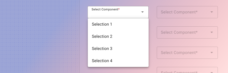
A dropdown menu is a compact way of displaying multiple choices. It appears upon interaction with an element (such as an icon or button) or when users perform a specific action.
Use when
- Choosing an option from a set of values
- Recommending a default option
Don't use when
- Displaying more than 10 options. Use an autocomplete instead.
- Selecting a single value is required. Use radio buttons instead.
- Displaying "yes" or "no" options. Use radio buttons instead.
Best practices
check_circle_outline
Use concise and consistent labels that describe the meaning of the select field.
check_circle_outline
Use sentence case only. Do not use all caps, title case, or lowercase
check_circle_outline
Use a logical order for the set of options: alphabetical, numeric, chronological, etc.
cancel
Don't use colons after labels.
cancel
Don't use all caps for the labels; it's harder to cognitively process.
Related
Components
- Use radio buttons to allow for the selection of a single option from a set.
- Use a switch to turn an item on or off.
- Use a button toggle to allow for the selection of a single option from a small set.
- Use choice chips to allow for the selection of a single option from a small set, especially in mobile contexts.
- Use checkboxes to allow users to select multiple options from a set.
- Use an autocomplete to allow users to search and select from long lists.
Patterns
- Forms (Coming soon!)