Button toggle

Overview
A button toggle groups related options. This can be used in a variety of different ways, allowing users to select one option out of a group in a similar manner to radio buttons. Another common action is using it to swap between different views of the same information. To emphasize groups of related toggle buttons, a group should share a common container.
In general only one option in a group of toggle buttons can be selected and active at a time. Selecting one option deselects any other.
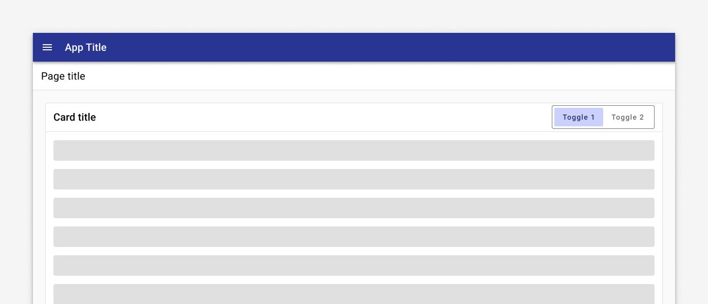
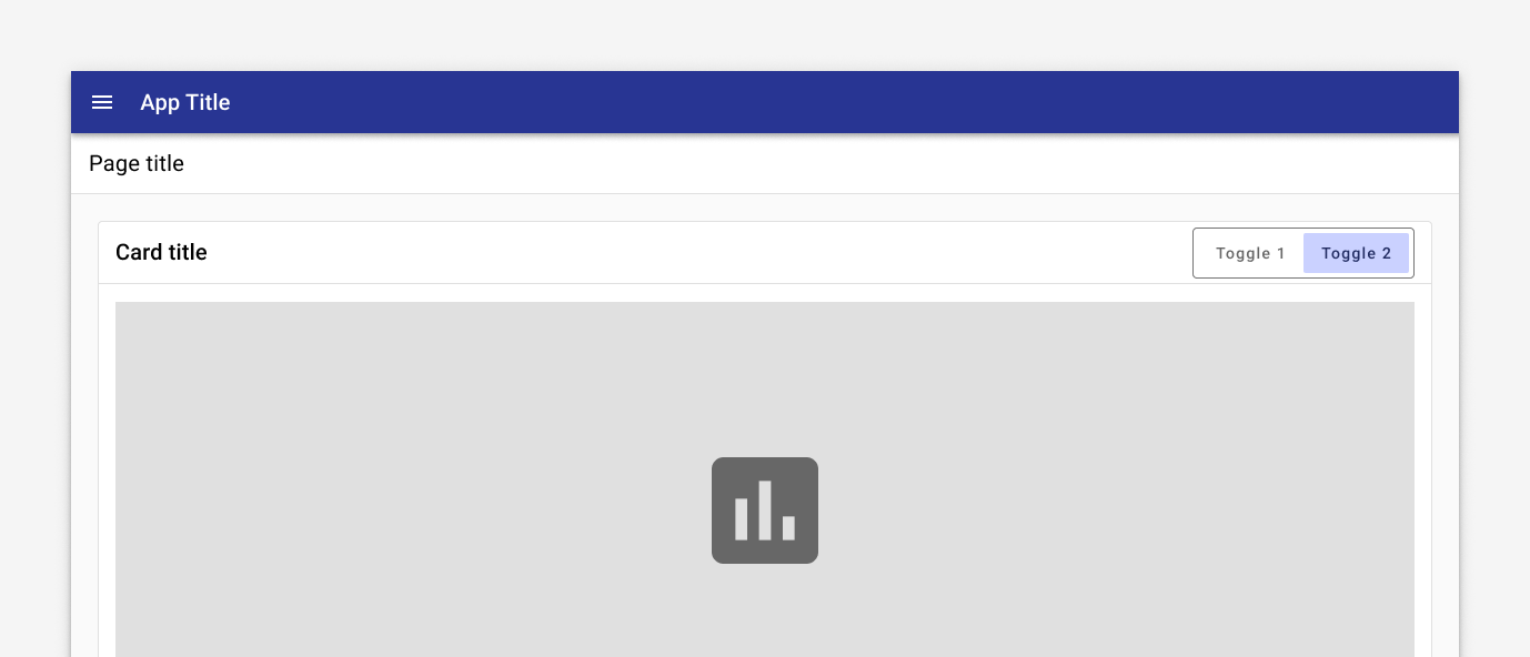
An example use case for the button toggle is giving the user the ability to swap between two different views of the same data.
Use when
- Users can select a single option from a group.
Don't use when
- Users can select multiple options from a group. Use choice chips or checkboxes instead.
- There are more than four options. Use a select instead.
Related
Components
- Use choice chips to display options where users can choose more than one.
- Use a select to display a large number of options where screen real estate is limited.
- Use radios to allow users to select a single option from a list.
- Use checkboxes to allow users to select multiple options from a list.
- Buttons