Chips
Overview
Chips allow users to enter information, make selections, filter content, or trigger actions. Chips should appear dynamically as a group of multiple interactive elements, unlike buttons, which should be a consistent and familiar call to action.
Use when
- Displaying interactive options
- Displaying simple filters
- Displaying removable input options such as contacts
Don't use when
- Displaying static attributes. Use badges instead.
Types
There are three types of chips: 1. Input chips, 2. Choice chips, 3. Action chips, 4. Filter chips.
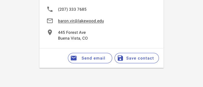
1. Input chips
Input chips represent information used in fields, such as an entity or different attributes. An input chip's text is editable until the user takes an action with the chip, such as sending an email. To edit an input chip's text, tap the chip.
Input chips can be integrated with other components. They can appear:
- Inline with the text input cursor in a field
- In a stacked list
- In a horizontally scrollable list
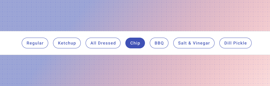
2. Choice chips
Choice chips allow users to make a selection from a set of choices. Choice chips clearly delineate and display options in a compact area.
Use a button toggle or radio buttons when users can only select a single option.
Use a select or autocomplete when there are too many options for the screen real estate provided.
Most commonly used in onboarding flows or mobile contexts.
3. Action chips
Action chips offer actions related to primary content. They should appear dynamically and contextually in a UI.
An alternative to action chips are buttons, which should appear persistently and consistently.
Action chips can trigger an action or show progress and confirmation.
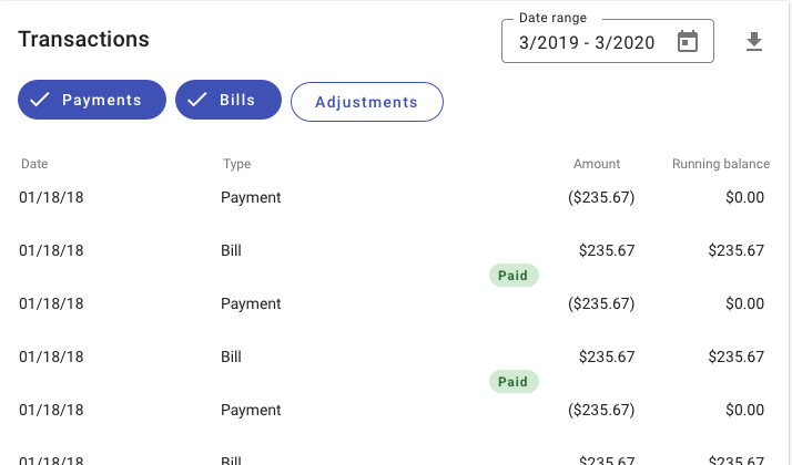
4. Filter chips
Filter chips use tags or descriptive words to filter content. Filter chips delineate and display options in a compact area.
Chips are tapped to be selected. Multiple chips can be selected or unselected. A check icon is added to indicate when a filter chip is selected.
For datasets with more than seven filters or for sets that have categories and sub-filters, use a faceted filtering (coming soon!) pattern.
Best practices
Chips may contain a leading or trailing icon.
Chips are interactive.
Chips may scroll horizontally, especially on mobile.
Don't display non interactive data with a chip. Use a text badge instead.
Don't use filter chips or choice chips to display a single option only.
Related
Components
- Use a badge for non-interactive data.
- Chips may be used with lists, tables, or cards.
- Choices may also be represented by radio buttons, checkboxes, or button toggles.
Patterns
- Faceted filtering (Coming soon!)
- Collections (Coming soon!)