Badge
Overview
Badges are non-interactive components used to inform status, counts, or as a descriptive label.
1. Use an amber background for dot or numeric badges against an indigo background. 2. Use the tertiary color for badges against a white background.
Types
There are three types of badges: 1. dot badges, 2. numeric badges, 3. text badges.
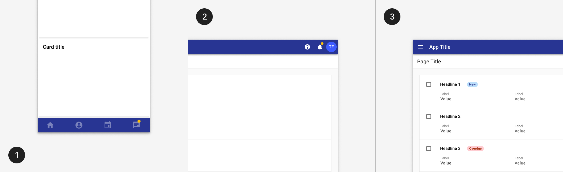
- Use a dot badge to indicate new or unread content exists.
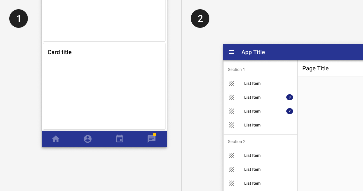
- Use a numeric badge for numeric counts.
- Use a text status badge to communicate status or description.
- Use a chip instead for interaction, selection, or filtering.
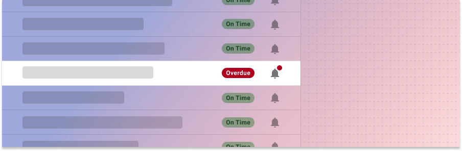
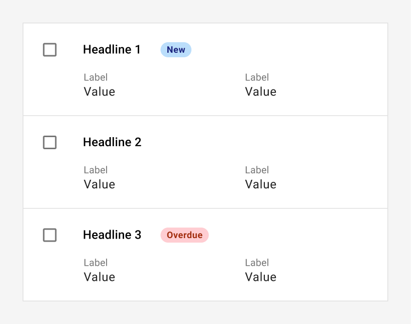
1. Use a dot badge to indicate new content exists, such as an “unread messages” indicator in a bottom app bar. 2. Use a numeric badge for specific counts, such as the number of new notifications. 3. Use text status badges to communicate statuses, such as “New” or “Overdue.”
Dot badge
Dot badges are used to indicated that unread content exists. They are used most frequently on navigation items or tabs to indicate content inside, but may also be used with lists and tables. Dot badges don't contain text or numbers.
Dot badges should use the secondary color when placed on an indigo background and the tertiary color when placed on a white background. See color guidance.
Numeric badges
Numeric badges are used for counts, such as a number of unread messages, new records, or total records in a category.
Numeric badges should use the secondary color when placed on an indigo background and the tertiary color when placed on a white background. See color guidance.
Numeric badges should be used to highlight new items, such as notifications or new tasks. Don't use numeric badges to indicate static counts, such as search results or total records in a table.
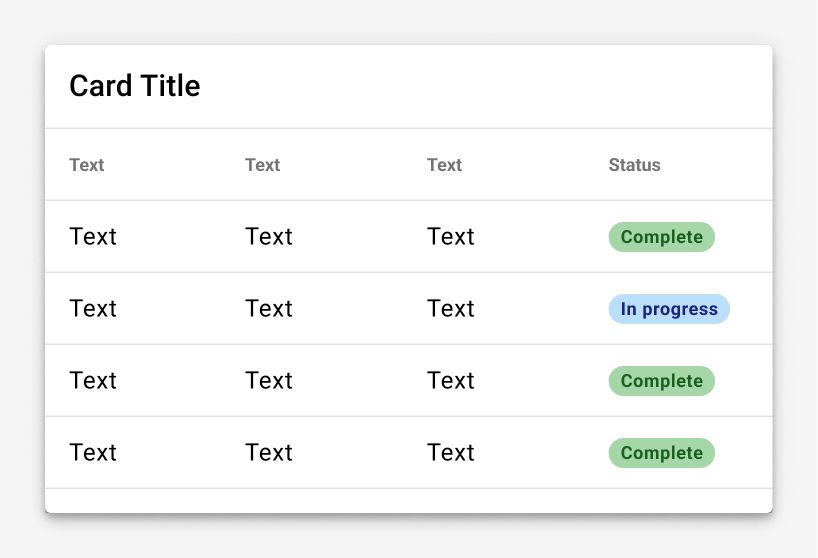
Text badge
Text badges are used to communicate a status or description. Badges may be used to add visual prominence to an important attribute of a specific record. At most, one badge should be used per record.
Palettes
Text badges are either muted or bold and use color to indicate meanings that users can learn and recognize across products. Use muted badges by default. In cases where more visual emphasis is needed, use bold badges instead. In general, only pages where just a few badges are used should use the bold style.
| Muted | Strong | Description | Uses |
|---|---|---|---|
| Use for a general status or state. | New, moved, information, help | ||
| Use for a general status or state. | New, moved, information, help | ||
| Use to indicate errors or items that are problematic | Errors, declined, removed, failed, critical | ||
| Use to indicate items that are coming due or require attention. | Coming due, missing, warning, blocked | ||
| Use to celebrate a success. | Available, done, approved, resolved, added |
Best practices
Use muted badges when they may dominate the screen, such as in long tables with a lot of badges.
Use badges to draw attention to specific cases. This list uses badges to indicate incidents coming due, but doesn’t use a badge on every list item.
Don’t use badges for long phrases or sentences.
Related
Components
- Use a chip instead of a badge for interaction, selection, or filtering.
Badges may be used with: