Filter sidesheet
Overview
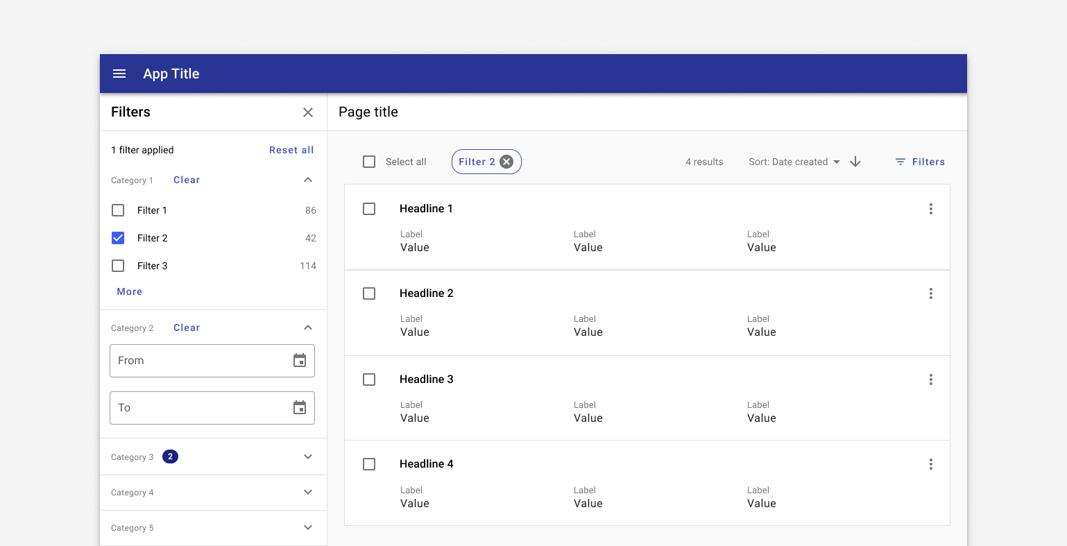
A filter sidesheet is used with the Search & filter pattern. The sidesheet is comprised of categories, called filters, with specific options, called facets, inside.
In general, filters are applied after an initial search has been conducted.
Use when
- Users are likely to run a broad search and filter down to a smaller set of records.
- Users are browsing a set of records.
- Users are creating a set of related records.
- Users might be unfamiliar with a domain space and could use filters to learn about the structure of the space itself.
Don't use when
- Users are searching a specific, known, record with specific existing criteria such as an address or ID. Use a simple or advanced search instead.
- There are fewer than five total filter options. Use chips instead.
- Users are likely to filter on only a single dimension. Use a table and column filters instead.
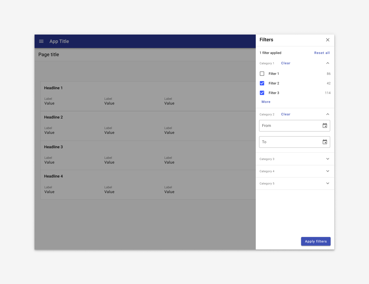
Parts
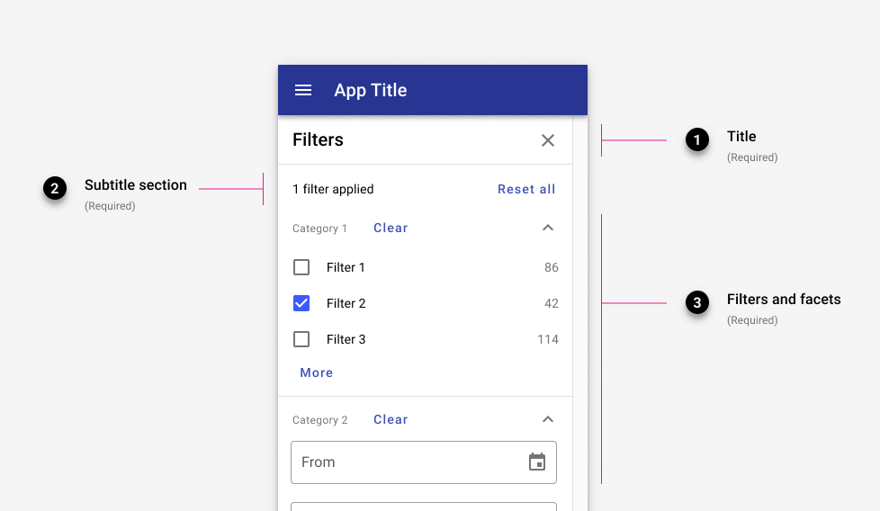
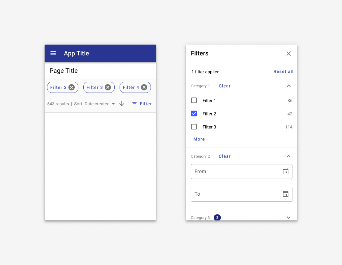
1. Title (required)
The side sheet may be dismissable if a business case requires it.
2. Subtitle section (required)
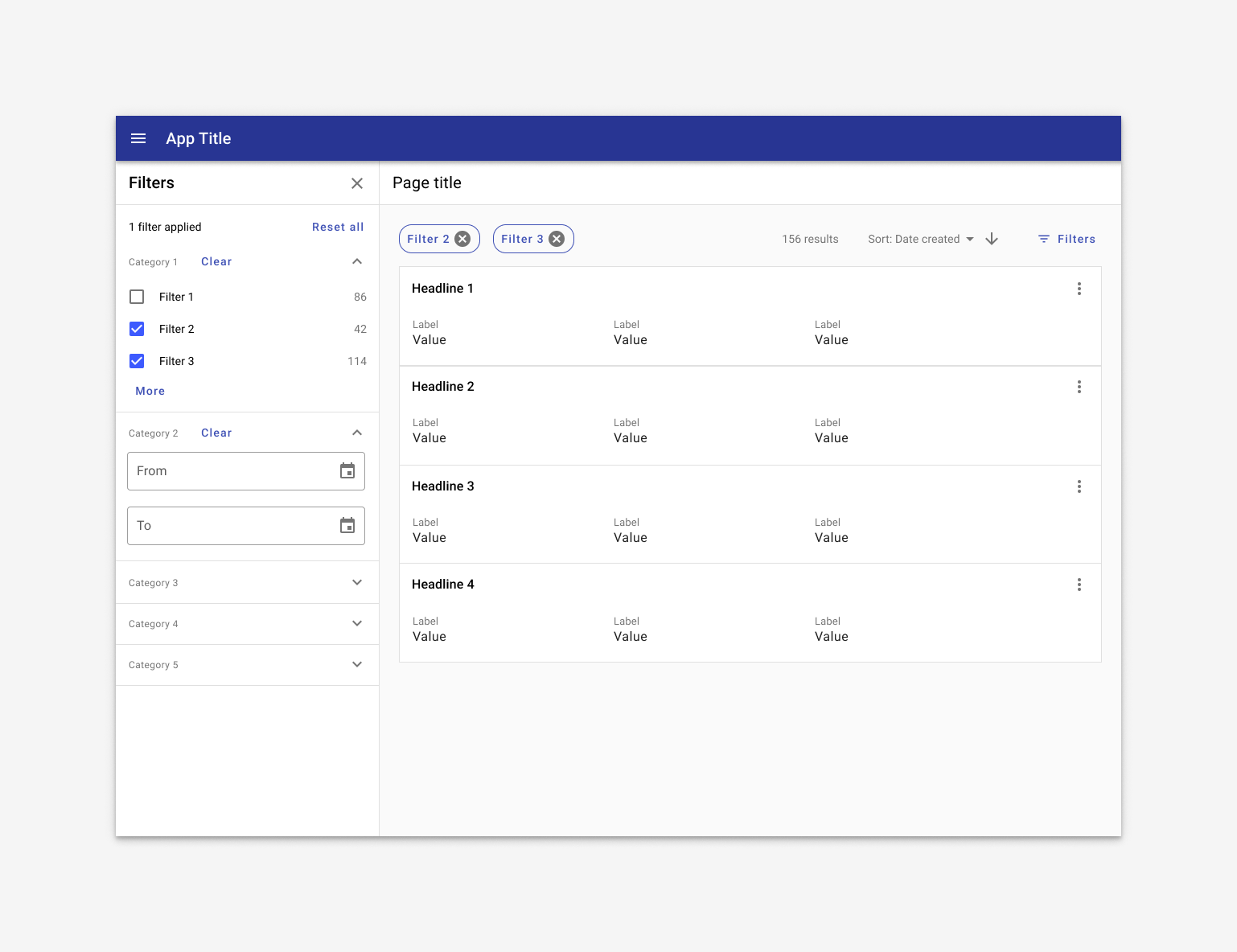
In the subtitle section, the total filters applied is displayed along with a "Reset all" button to clear all filters currently applied.
3. Filters and facets (container is 320px by default)
Filters are categories that are comprised of individual facets.
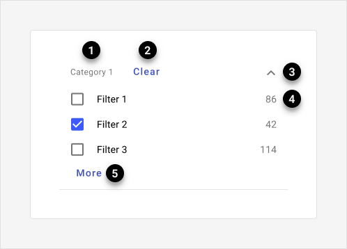
Filters are comprised of 5 parts:
- Filter title (Required)
- Clear (Required)
- Expansion (Required)
- Facet (Required) Facets may be displayed as radio buttons, checkboxes, date pickers, or sliders.
- More (Optional) Filters containing more than five facets hide extra options under a “more” expansion.
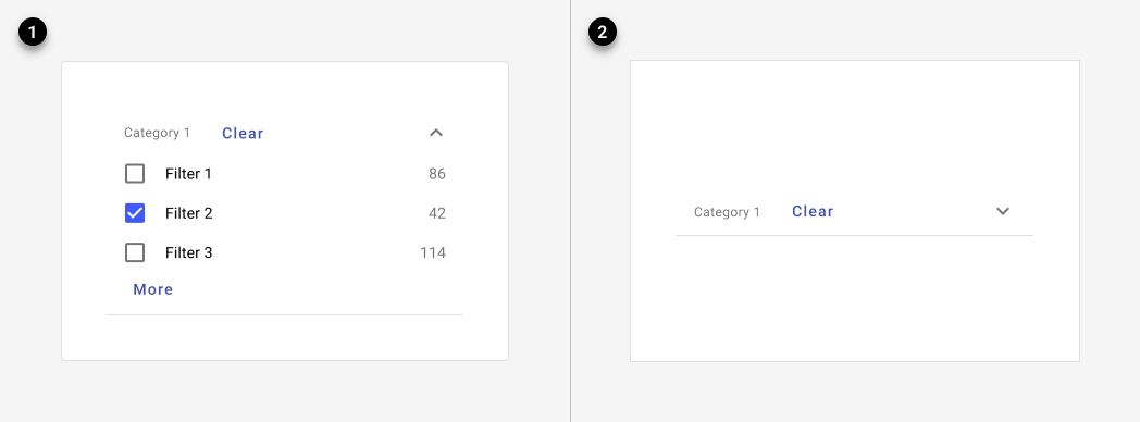
Individual filters may be collapsible if they contain a large number of options.
Facets may be displayed as radio buttons, checkboxes, date pickers, or sliders.
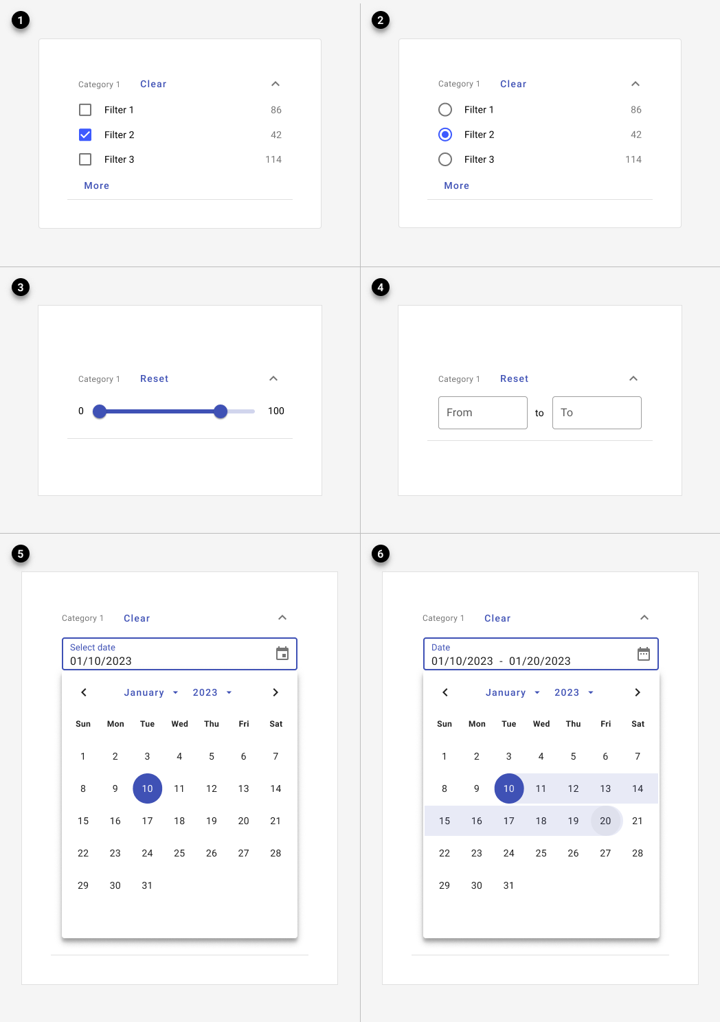
- Checkboxes: Categories (dynamic counts are optional.)
- Radio buttons: Exclusive categories (dynamic counts are optional.)
- Sliders: Approximate ranges.
- Range: Specific, discrete ranges.
- Date range: Specific date ranges.
- Date picker: A single date.
If dynamic counts are used, a numeric badge with white text and tertiary background color should be used. See numeric badge guidance for more information.
4. Chips
Use chips to indicate which filters have been applied.
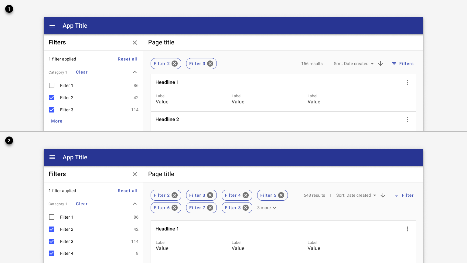
1. Filter chips indicate active filters and are placed above the search results.
2. Filter chips are limited to a two lines with an option to expans for more.
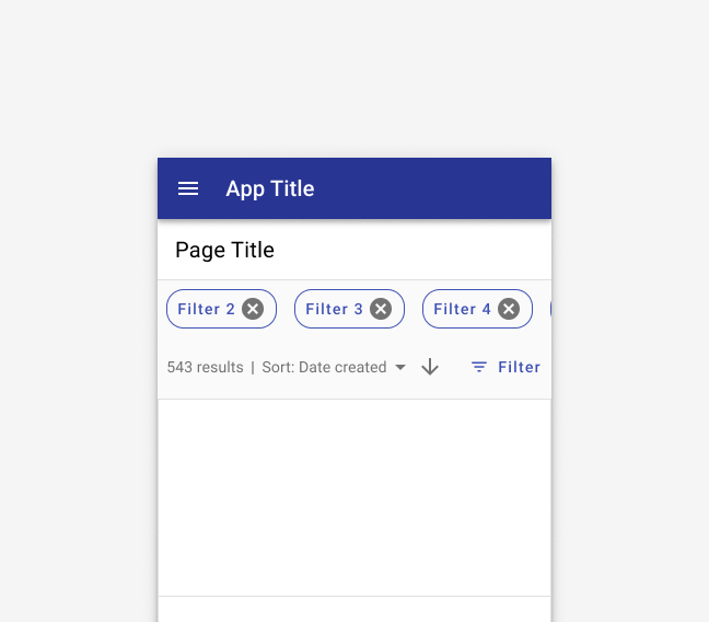
Chips use a horizontal overflow on mobile. Users may swipe left to view more.
Variants
By default, filters should be applied in real time.
When referencing the example below, use the filter sidesheet component and the page state error for "no results" instead.
Filters are applied to the search results as they're applied.
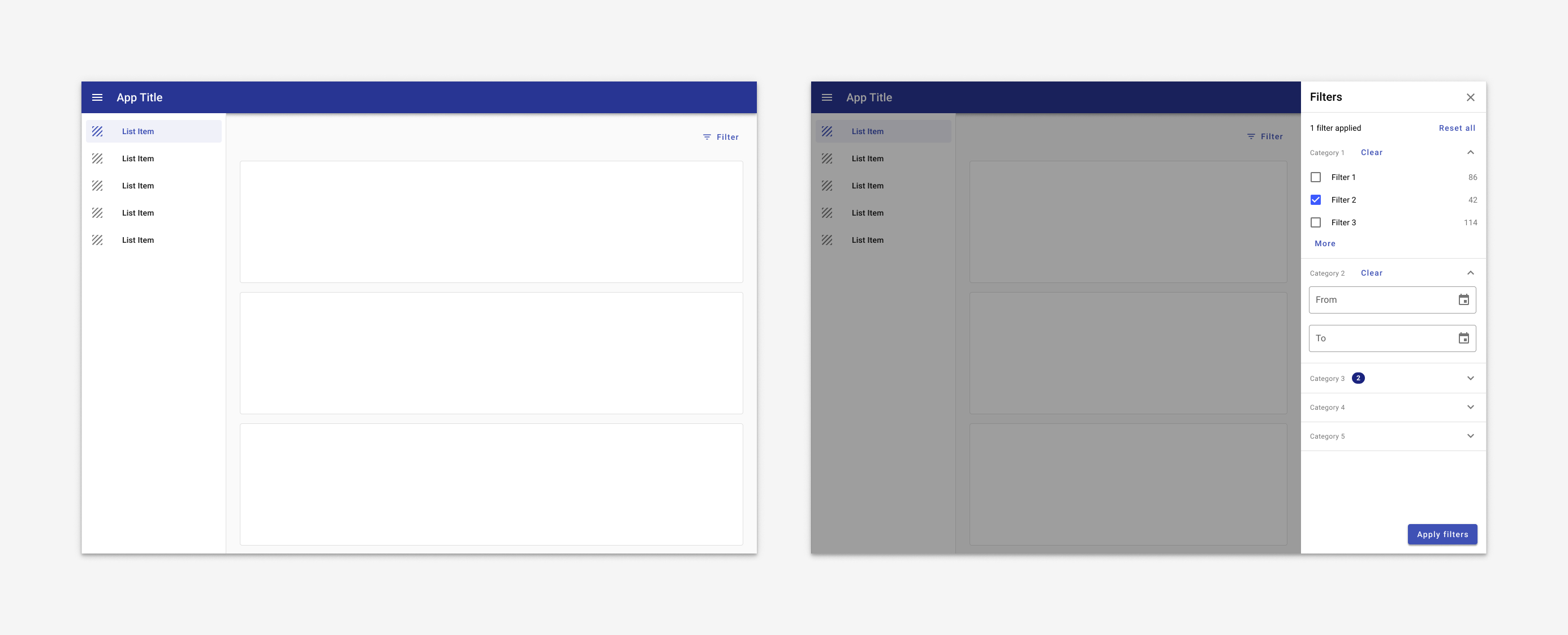
If filters cannot be applied in real time due to performance concerns, an "Apply filter" may be used.
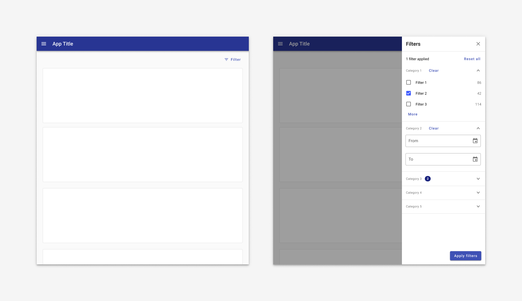
When performance may be an issue, an app may use a filter sidesheet with a scrim. Users select the filters they'd like, then hit Apply to filter down the dataset with just one data call.
Responsive
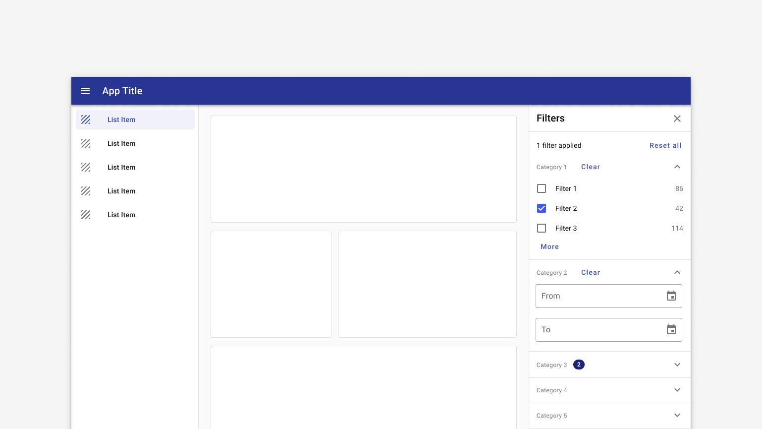
By default, the filter sidesheet displays on the left.
1. Default
Desktop
In desktop, filter sidesheet displays on the left by default. Filters are updated in real time.
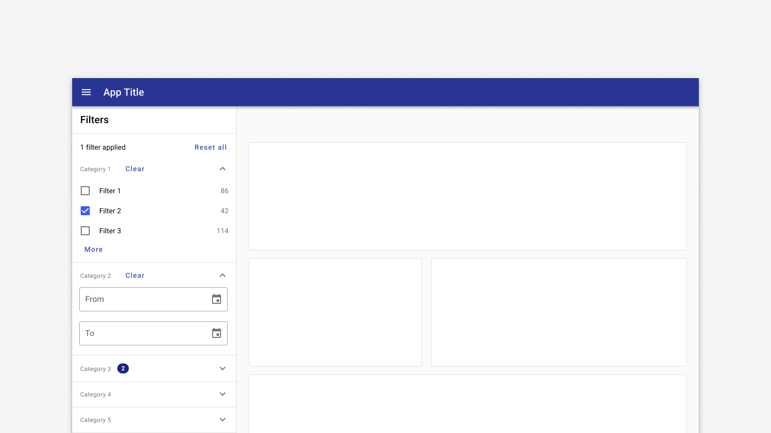
Desktop layout for an app with filters on the left.
Tablet
Filter sidesheet displays by default in landscape mode. In portrait mode, it's closed by default and accessed by tapping a "Filter" button.
When filters are displayed as sidesheet with scrim, filters are applied on tapping an "Apply filters" button, which also closes the sidesheet. The "Apply filters" button is positioned at the bottom of the viewport so it's always visible; content scrolls behind it as necessary.
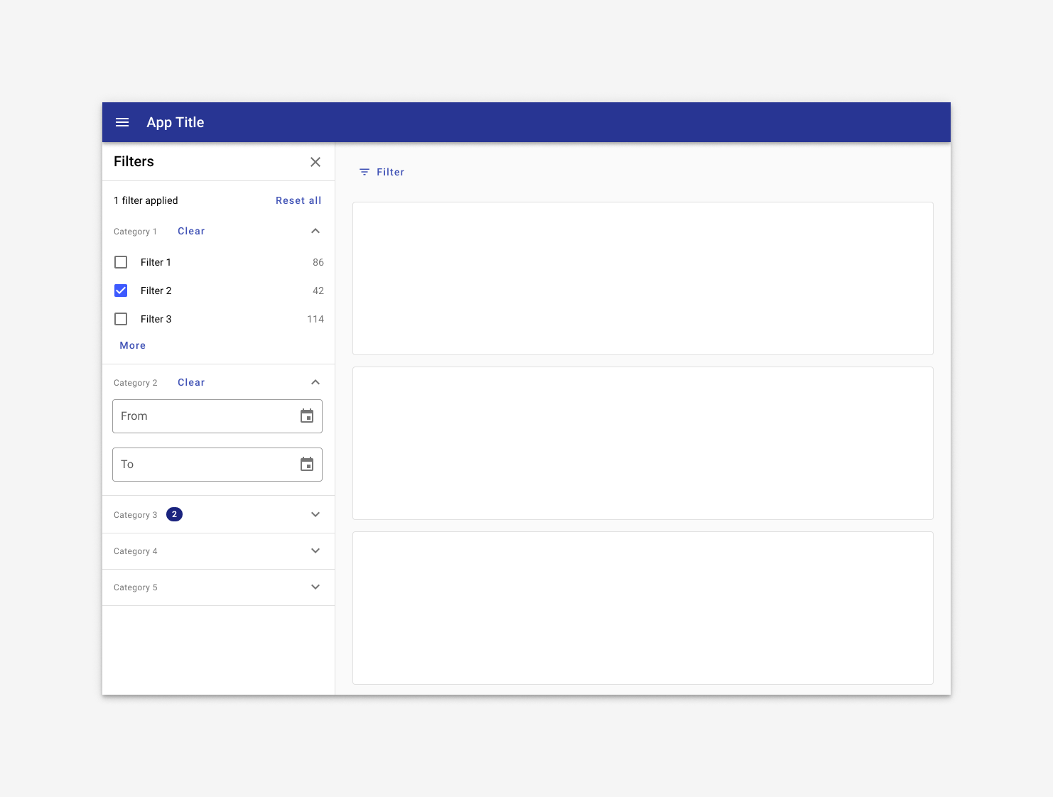
On tablet in landscap mode, the filter sidesheet is open by default.
On tablet in portrait mode, the filter sidesheet is closed by default, accessed by a Filter button. The sidesheet displays from the left with a scrim behind it and an explicit option to apply filters. The Apply button closes the drawer and applies filters.
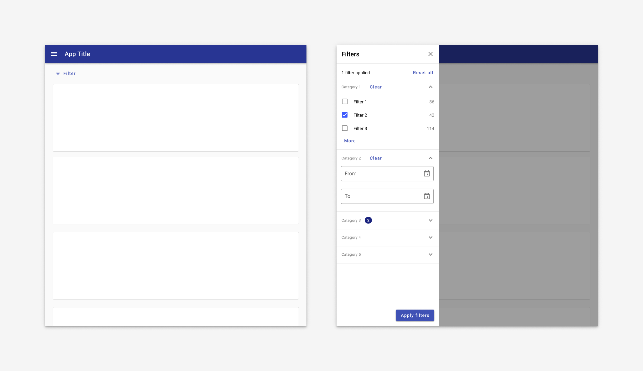
Mobile
On mobile, a filter sidesheet may take over the full screen or it may be displayed as a row of filters with dropdowns.
Best for web responsive. At mobile portrait sizes, both navigation drawer and filter sidesheet are closed by default. The filter sidesheet takes over the full screen when the Filter button is tapped. Filters are applied with an explicit Apply button that closes the drawers.
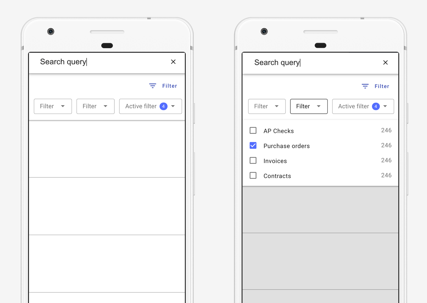
Best for native mobile. Filters display as a row of dropdowns. On tap, the dropdown opens to reveal filters. Applied filters are indicated by a numeric badge within the dropdown.
2. Lefthand drawer and sidesheet
When a navigation drawer is present, the filter sidesheet displays on the right. If dismissible, the sidesheet is toggled by an icon (use 'filter' for filters or an appropriate icon for detail information).
Desktop
On desktop, both the navigation drawer and filter display by default.
Tablet
Filter sidesheet displays by default in landscape mode. In portrait mode, it's closed by default and accessed by tapping a "Filter" button.
When filters are displayed as sidesheet with scrim, filters are applied on tapping an "Apply filters" button, which also closes the sidesheet. The "Apply filters" button is positioned at the bottom of the viewport so it's always visible; content scrolls behind it as necessary.
On tablet in landscape mode, the navigation drawer is open by default and the filter sidesheet opens from the right with a scrim behind it when the Filter button is tapped. Filters are applied with an explicit Apply button that closes the drawers.
On tablet in portrait mode, both navigation drawer and filter sidesheet are closed by default. The filter sidesheet opens from the right with a scrim behind it when the Filter button is tapped. Filters are applied with an explicit Apply button that closes the drawers.