Skeleton
Overview: Progress indicators
Progress indicators inform users about the status of ongoing processes, such as loading an app, submitting a form, or saving updates. They communicate an app’s state and indicate available actions, such as whether users can navigate away from the current screen. Use a progress indicator for operations that take more than 1 second.
Progress indicators are used to:
- Assure the user that the system is working.
- Provide operational transparency.
- Communicate progress made vs progress pending.
- Reduce users perception of time elapsed.
Types of progress indicators
| Context | Component | Guidance |
|---|---|---|
| Initial page load | Skeleton + progressive loading | Use skeleton loading when content size/shape is known. Load skeleton components, then fade in components as they become available. |
| Initial page load | Linear page progress | Use when the content to be loaded is of unknown or variable size or quantity. Display a description of the process with a linear progress bar (see pattern below). |
| Full page load or change | Full page busy indicator | Use an overlay to prevent users from interacting with content on a page due to a change, server error, or form submission. |
| Multiple components | Skeleton + progressive loading | Load skeleton components, then fade in components as they become available. |
| Single component within a page | Inline circular progress spinner | Use a contextual circular progress spinner to communicate that either a component's state or data is changing. |
Overview: Skeleton
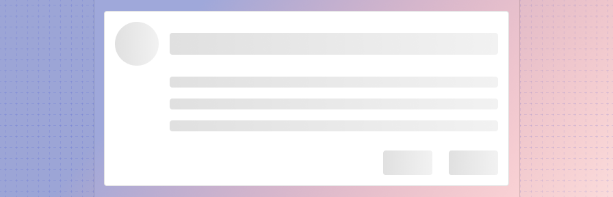
A skeleton screen is a low fidelity UI into which information is gradually loaded. It gives users a visual cue that the content is being loaded into each UI element and can create perceptions of faster load times (check out a sample UX study). Because of this, it is Forge’s recommended method for loading in new content. Use when content size/shape is known.
Skeleton patterns can be used to load a page initially or to load specific components after an initial load while still allowing users to interact with the rest of the page.
Benefits of skeleton loading:
- Puts the focus on progress, rather than wait time.
- Is associated with faster perceived loads times
- Eliminates surprise.
- Provides a clear indication of progress.
Best practices
Use Use skeleton loading when content size/shape is known and the wait time is longer than 1 second.
Ensure that performance is optimized within the application to minimize load times overall.
When loading a list, displaying two to three "list items" in the skeleton should suffice; the skeleton items don't need to match the final number of elements loaded in.
Build complex UIs with a skeleton. Rectangles and circles work well to represent most UI elements.
Don't use a skeleton for pages that should take under a second to load.
Related
Components
- Use a linear progress indicator to communicate that a specific component is loading. Linear progress indicators may be used at the bottom of text fields, in dropdowns, and in expansion panels.
- Use a full page busy indicator to to prevent users from interacting with content on a page due to a change, server error, or form submission.
- Use a circular progress spinner inside a component to communicate that either a component's state or data is changing.
Patterns
Resources
- What you should know about skeleton screens (UXDesign.cc)
- Wait Wait... Tell Me! (99% Invisible)
- Everything you need to know about skeleton screens (Medium)
- Progressive Loading (MDN Web Docs)
- Improving the UX of Progress Indicators and Feedback Notifications (Usersnap)
- Mobile Design Details: Avoid The Spinner (LukeW)
- How to Improve Perceived Waiting Time in HCI: A Psychological Approach (Study)
- The Illusion of Time (Medium)