Busy indicator

Overview: Progress indicators
Progress indicators inform users about the status of ongoing processes, such as loading an app, submitting a form, or saving updates. They communicate an app’s state and indicate available actions, such as whether users can navigate away from the current screen. Use a progress indicator for operations that take more than 1 second.
Progress indicators are used to:
- Assure the user that the system is working.
- Provide operational transparency.
- Communicate progress made vs progress pending.
- Reduce users perception of time elapsed.
Types of progress indicators
| Context | Component | Guidance |
|---|---|---|
| Initial page load | Skeleton + progressive loading | Use skeleton loading when content size/shape is known. Load skeleton components, then fade in components as they become available. |
| Initial page load | Linear page progress | Use when the content to be loaded is of unknown or variable size or quantity. Display a description of the process with a linear progress bar (see pattern below). |
| Full page load or change | Full page busy indicator | Use an overlay to prevent users from interacting with content on a page due to a change, server error, or form submission. |
| Multiple components | Skeleton + progressive loading | Load skeleton components, then fade in components as they become available. |
| Single component within a page | Inline circular progress indicator | Use a contextual circular progress indicator to communicate that either a component's state or data is changing. |
Overview: Busy indicator
Use a busy indicator when the entire page is loading or changing and users should be prevented from interacting with any content on the page.
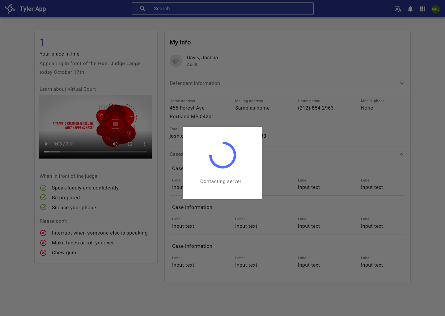
Busy indicator text may use the following formats.
[Object]is being [operation name], or[Object]is being [operation name] to [destination name] or[Object]is being [operation name] from to [destination name]
Real-world examples include copying files to a storage location, saving edits to a file, and more.
Resources
- Wait Wait... Tell Me! (99% Invisible)
- Everything you need to know about skeleton screens (Medium)
- Progressive Loading (MDN Web Docs)
- Improving the UX of Progress Indicators and Feedback Notifications (Usersnap)
- Mobile Design Details: Avoid The Spinner (LukeW)
- How to Improve Perceived Waiting Time in HCI: A Psychological Approach (Study)
- The Illusion of Time (Medium)
Research
Have you done usability testing on progress and loading? We’d love to hear from you!
Related
Components
- Use linear progress and circular progress components to indicate that individual elements are loading.
- Use [skeleton](/components/progress-and-loading/skeleton loading) to initially load content when size and shape is known.
- Use a backdrop (scrim) behind the busy indicator.
- A busy indicator is used with a dialog.
Patterns
- Progress and loading (coming soon!)