Toolbar
Overview
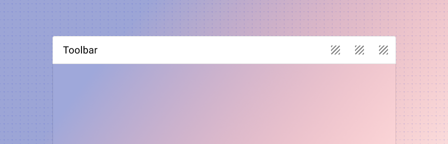
The toolbar spans 100% width, uses a border to separate the toolbar from the content area, and has slots for placing any content at the start, center, and end. It can be used below the app bar to display a page title and actions, within a nav drawer as a section, as a footer, or as header & footer in dialogs.
To see various common examples of the toolbar in action with code snippets, see the toolbar recipes page.
Related
Components
The toolbar can be used as:
- headers and footers in the scaffold for page layout.
- headers and footers in dialogs.
- as sections within a navigation drawer.
We've also built a responsive toolbar utility component that helps manage how a toolbar is rendered on large and small devices. The responsive toolbar allows developers to define separate content for large and mobile layouts, and it detects overflow to automatically swap between the two slots based on available space. For more information, check out the responsive toolbar component in the Forge Extended library.