Divider
Overview
Dividers can be vertical or horizontal to separate related content. Related content may either be visually separated by dividers or by white space. In general, using white space (consider 24px, 32px, or 48px to separate sections) feels cleaner and allows the design to breathe.
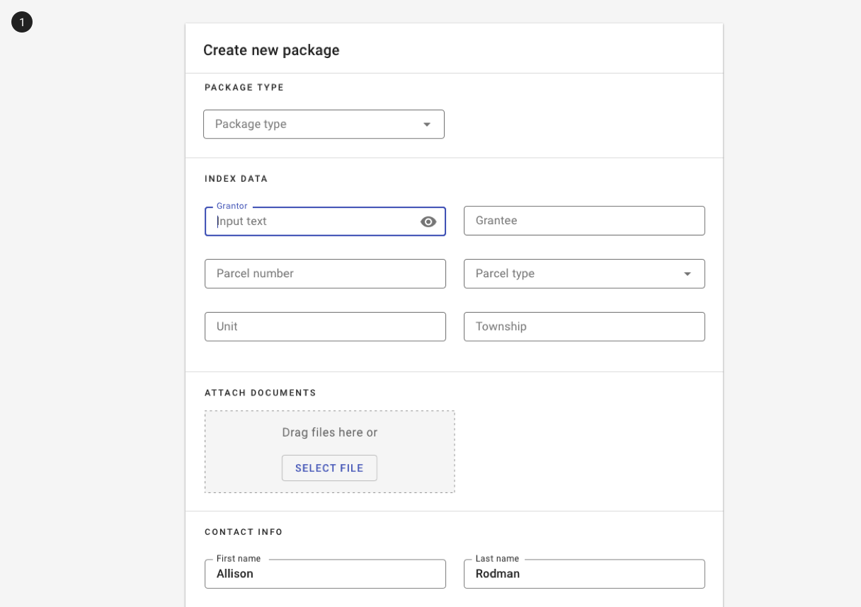
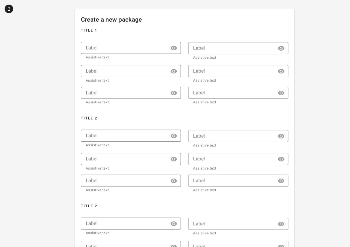
1. Complex content is visually separated with dividers.
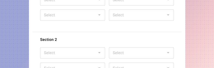
2. Simpler content - groups of form fields - are visually separated with white space.
Vertical dividers may also be used inside of toolbars to separate sections of icons. (Functionality to support this behavior is currently in the Forge backlog.)
Related
Components
Dividers may be used in:
Patterns
- Layout
- Forms (Coming soon!)