Bottom sheet

Overview
Bottom sheets provide contextual information, options, or actions in a way that's easy to reach on a mobile device.
Use when
- displaying a list of actions on mobile devices (modal bottom sheet).
- displaying additional detail that could be referenced for a record, such as details for a location on a map (standard bottom sheet).
Don't use when
- confirming destructive actions. Use a dialog instead.
- displaying contextual information on a desktop form factor. Use a sidesheet instead.
To learn about other components that display messages, such as toasts and banners, check out the System Communication guidance.
Types
Forge supports two types of bottom sheets: 1. Standard and 2. Modal
1. Standard
Standard bottom sheets display content that complements the screen's primary content and allow for simultaneously viewing and interacting with both regions. They are commonly used to keep a feature or secondary content visible on screen when content in main UI region is frequently scrolled or panned. They remain visible while users interact with the primary content. They're best for allowing users to reference contextual content, such as location details on a map.
On desktop, a standard bottom sheet may display as a sidesheet instead.
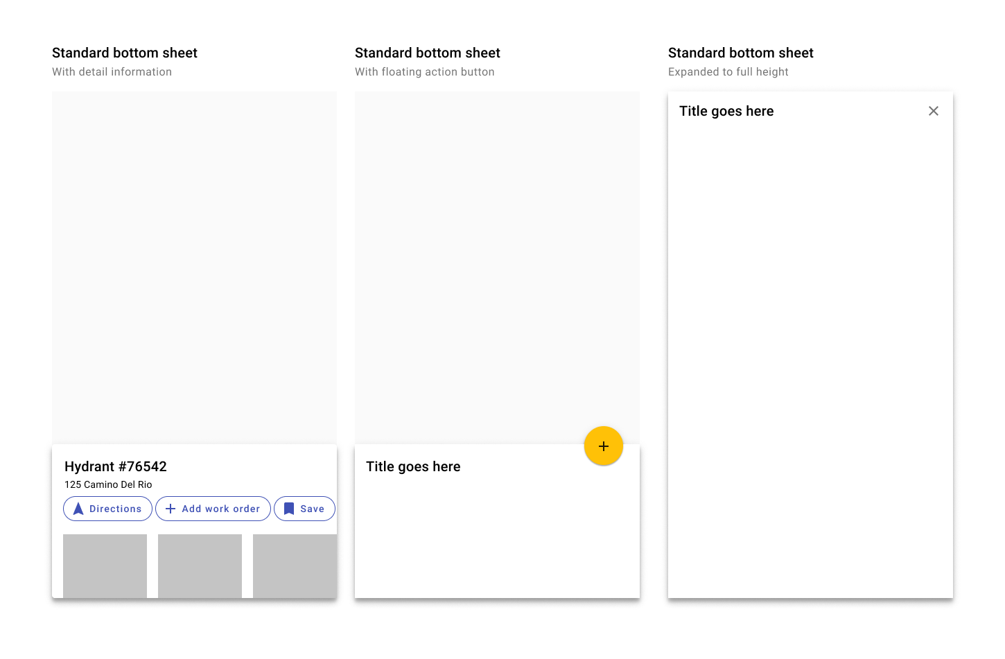
Standard modal bottom sheets may contain additional information or a FAB. They may be expanded to full height to display additional information.
Interactions
Bottom sheets may contain more information than what's initially visible on the screen. Initially, a bottom sheet displays at a max height of 50% of the visible screen. A bottom sheet can be tapped, swiped, or dragged up to become full-screen. Once full screen, it may be scrolled for addiitonal information.
Ensure that bottom sheets can be minimized again so that users can interact with the rest of the screen - either by an X icon, or dragged back down.
Drag the bottom sheet up to expand it. Once expanded, the bottom sheet may be scrolled for more information. Drag down or tap the X icon to minimize the bottom sheet.
2. Modal
Modal bottom sheets include a backdrop (scrim) and prevent users from interacting with the rest of the screen. They're best used for menus or collections of actions.
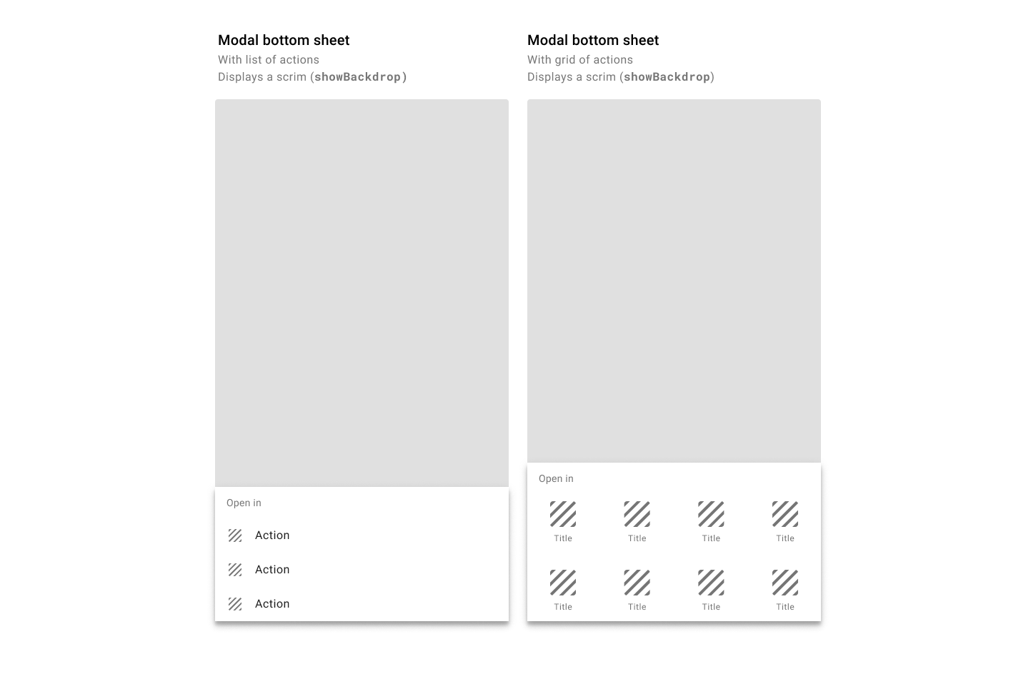
Modal bottom sheets display actions either as a list or as a grid.
Best practices
Anchor bottom sheets to the bottom of the view.
Allow users to tap outside a modal bottom sheet to dismiss it.
Standard bottom sheets are elevated above the main UI region so their visibility is not affected by panning or scrolling.
Modal bottom sheets can be used instead of menus to present additional screen actions.
A bottom sheet takes up no more than 50% of the height of the visible screen by default. Users can swipe up for more information.
Be careful adding buttons to a bottom sheet. Either use a modal bottom sheet to contain a collection of actions as a list or grid, or place action chips within a standard bottom sheet.
Don't use bottom sheets for confirming destructive actions. Use a dialog instead.
Bottoms sheets do not detach from the bottom of a screen.
Don't make tall bottom sheets full-screen upon opening. This places the top content immediately out of reach for users on mobile devices.
Related components
Components
- Use a toast to display low priority messages that disappear automatically.
- Use a banner to display high priority messages that disappear after user interaction.
- Use inline messages to display persistent information related to a specific component.
- Use button inside of dialogs.
- Steppers may be used with dialogs.