Stepper

Overview
Guided steppers provide a clear path to completion. Offering users a clear idea of how many steps it takes to get to the final target can significantly reduce abandonment. Additionally, presenting information in meaningful chunks can facilitate completion.
Use when
- Use for processes that may be unfamiliar or may be used only occasionally.
- Use for complex processes that are completed by a new user.
- Use for processes that could be customized for a user based on previous answers submitted.
- Use for processes that may need to combine data inputs from multiple apps in the Tyler ecosystem.
- Use for complex processes where tracking progress is important.
- Steppers may be used in a dialog or standalone in a single card.
- Examples: Multi step forms, online ordering / shopping cart, onboarding
Don't use when
- Don't use steppers for familiar or repetitive tasks; use a form instead.
Types
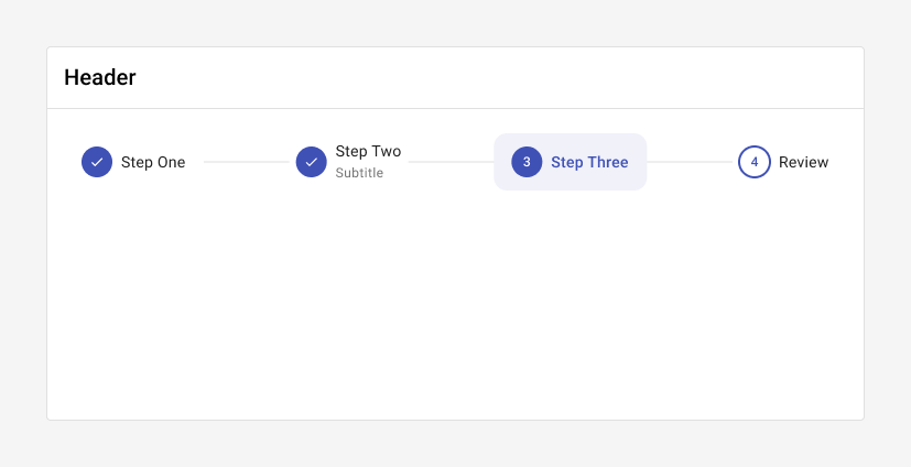
1. Horizontal mode
Horizontal steppers are better suited for desktop layouts.
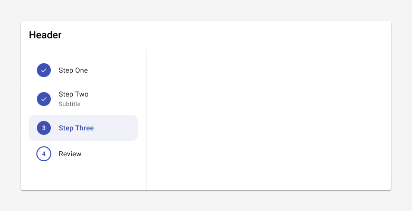
2. Vertical mode
Vertical steppers are better suited for mobile layouts.
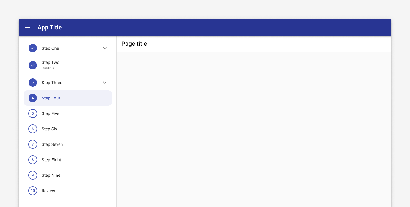
3. Complex stepper
Complex steppers may be used in desktop settings when a process has more than five steps or when it contains sub-steps.
Parts
Steppers consist of four main parts: 1. Header, 2. Stepper, 3. Content, and 4. Actions.
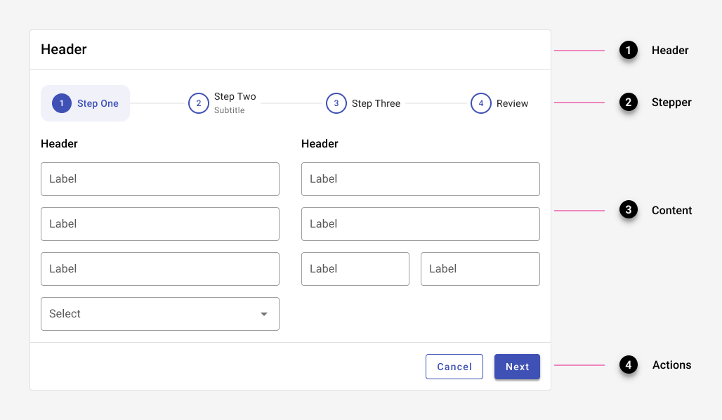
1. Header
The header contains the title for the stepper. Depending on the layout and the location of the stepper on the page, a header section might not be needed.
2. Stepper
The stepper section houses the stepper itself and all of its steps. Completed steps are indicated with a check. If previous steps may be edited, an edit icon may be used to draw additional attention to the fact. Steps with missing information are indicated with an error state.

Progress shown through a standard Forge stepper. Completed steps are indicated with a check.

Progress shown through a stepper where users can edit previous steps. Completed steps are indicated with an edit icon.

Indicate errored steps with an error state.
When a stepper is used in a smaller container, text may be placed below the step instead of inline.

3. Content
Break up content into manageable chunks.
Use a container that matches the approximate size of the content.
Keep the overall container size fixed to allow for consistent placement of controls.
Center content within the overall container.
A single column of content is preferable, but two columns may be used if needed.
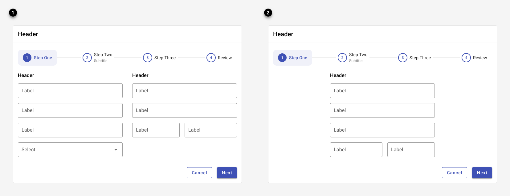
Stepper content is displayed either in a single or double columns.
4. Actions
If users will need more than a single session to complete the process, allow them to save their work in draft mode. Otherwise, provide options for "Next," "Previous," and "Cancel" by default.
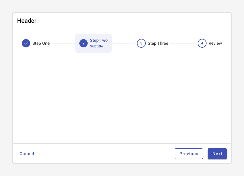
By default, a stepper includes Next, Previous, and Cancel in its action footer.

When users may save changes, the stepper includes an X in the top right corner, as well as actions for Next, Previous, and Save and quit in its action footer.
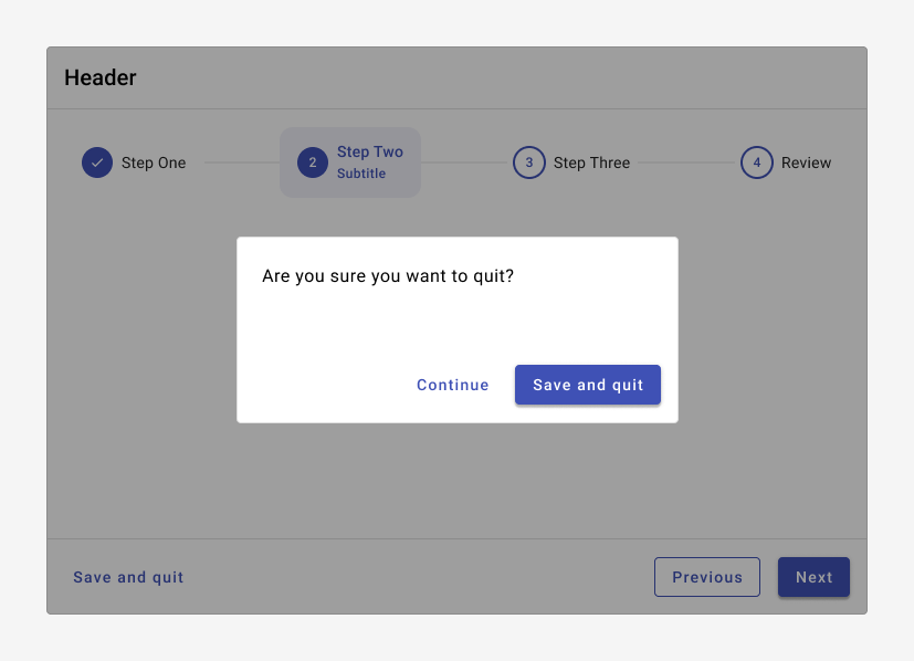
When a user exits a stepper, confirm the action with a dialog.
Best practices
Place steppers on a single piece of material - either on a card or in a dialog.
Small steps are preferable - it makes the experience less overwhelming, requires less cognitive effort, and results in fewer mistakes.
If possible, allow users to exit the process midway and save their progress.
Ensure that a stepper is self sufficient - ensure that users can access the information they need from within the stepper.
Focus on the shortest path for each user - if necessary, use branching logic to customize questions based on previous responses.
Mark optional steps as such.
Provide users the ability to return to a previous step or use the steps to navigate back in the process, if possible.
Use a casual, conversational tone.
Don't use a stepper for processes that are familiar or have to be used over and again - they can become overly controlling.
Avoid requiring information from another part of the app, causing the user to leave and restart the stepper.
Don't create a separate step for "Submit." A final step may be "Review"; if there is no review in the process, the last step should display a button for "Submit."
Related
Components
Steppers are comprised of: