Landing page layout
Overview
The landing page component is a layout component with slots for header and body content to create consistent landing pages across community apps. It takes care of positioning and spacing and facilitates responsive design.
Use when
- Building community apps.
- Designing a starting point for unauthenticated (not logged in) users.
- Designing a a starting point for authenticated (logged in) users.
Don't use when
- Designing workforce apps.
Parts
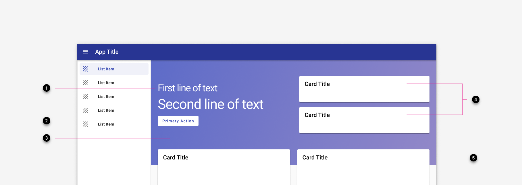
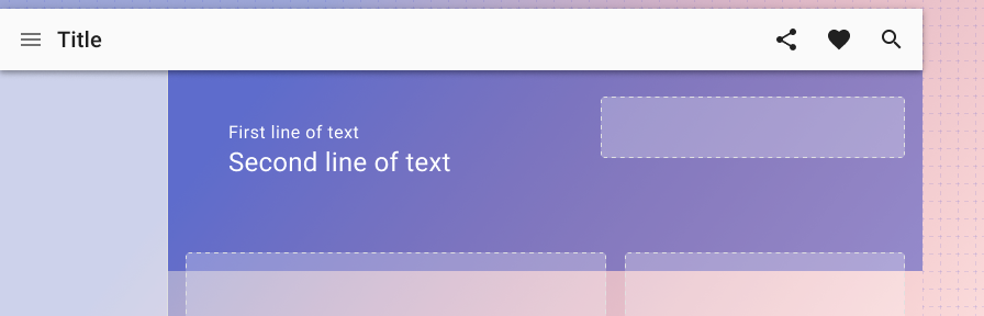
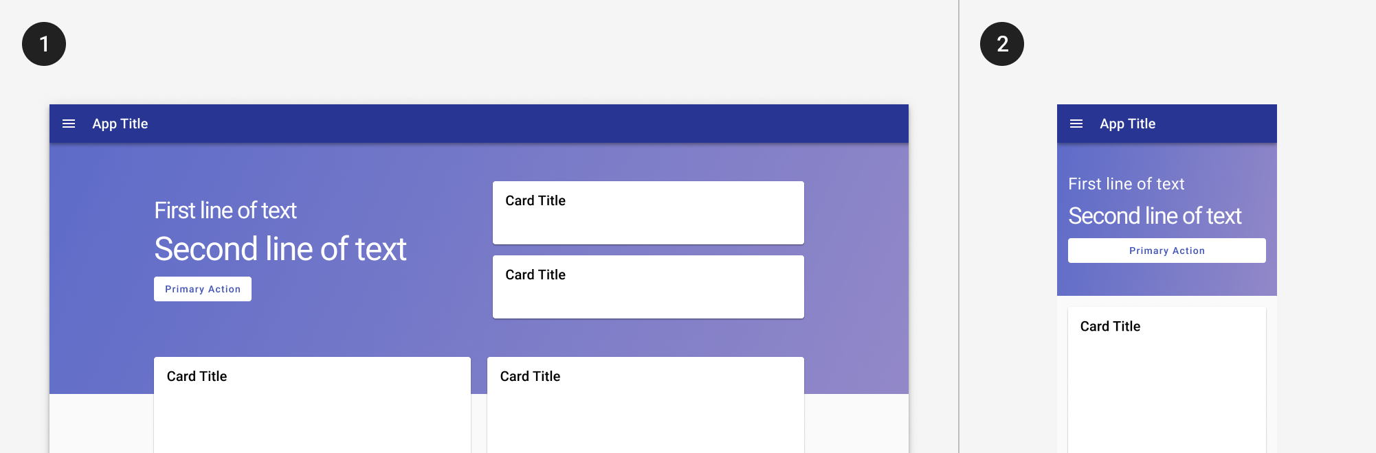
- Primary text. (Required) Up to two lines of primary text, such as a welcome message or a call to action. ("Welcome back, Dylan!" "Hey there Dylan, your current balance is $120.00").
- Actions. (Optional) Up to two actions, such as "Pay balance," "Start a bid," etc. The first action uses a raised button, the second uses an outlined button.
- Banner image. (Required) A default image is provided, but can be customized by the client. The template provides an overlay by default. Clients should provide a desktop and mobile image.
- Announcements. (Optional) Up to two announcements may be displayed, configured by the app team.
- Primary content. (Required) Primary content may be displayed in a single, double, or triple column. The template takes care of the column spacing.
Variants
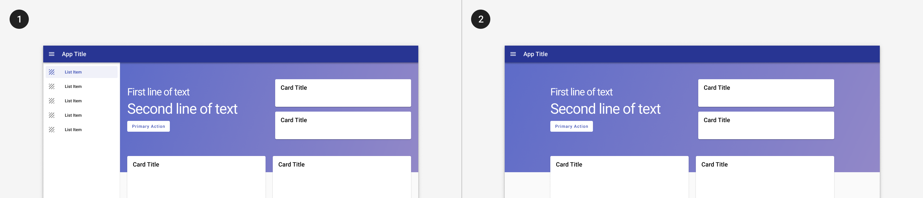
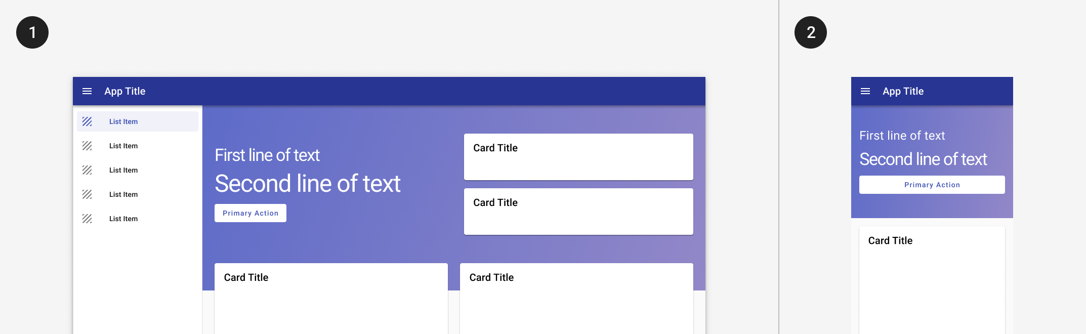
- With navigation drawer Content is left aligned on desktop, centered on mobile.
- Without navigation drawer Content is centered, on both desktop and mobile.
Responsive
info
Layout collapses to a single column layout on mobile.
Related
Components
Patterns
- Understand key principles of layout in order to create a landing page that works.