Menu

Overview
Menus display lists of related options (which can be grouped together) as well as unrelated options. Menus appear when a user taps an interactive UI element such as an icon, button, action, or content, such as selected items or text.
Menus appear in front of all other permanent UI elements. They typically appear next to (or in front of) the element that generates them. If they are in a position to be cut off by the browser or screen’s edge, the menu can instead appear to the left, right, or above the element that generates it.
Parts
1. Menu items
Menu items may use text only or may include icons. In general, choose consistency - either use icons for all or icons for none.
1. A dropdown may use icons for familiar actions.
2. A dropdown may use text only options for domain specific items.
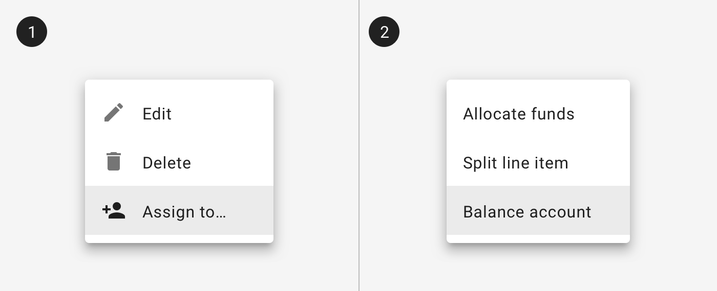
2. Categories
Menus may include multiple categories of information. Like information should be grouped together and separated by a divider or a section title.
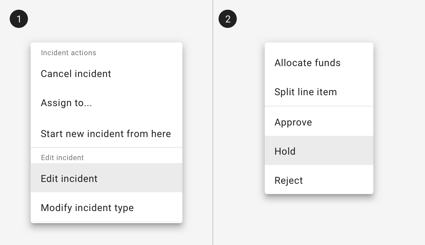
1. A menu may be divided into sections using section titles.
2. A menu may be divided into sections using dividers.
3. Cascading menus
Menus can contain sub menus in a cascading style. Typically the sub menu opens to the right of the parent menu item, but when a menu opens close to the edge of the screen or browser window the menu can open on the left side.
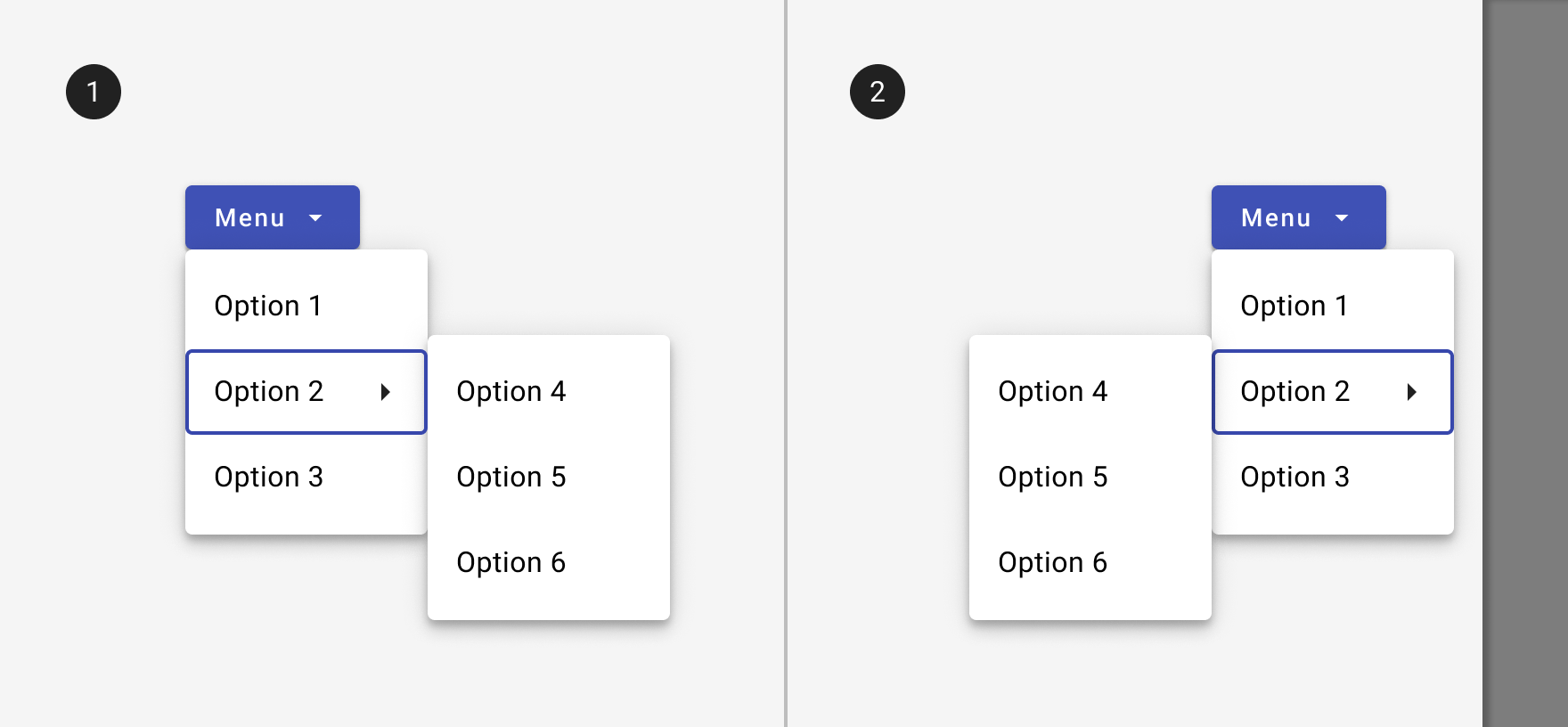
1. A menu with a sub menu open.
2. The sub menu can open on the left if there isn't enough room to display it to the right of the parent menu.
Related
Components
- For an input with selectable options, use a select.