Split button
Overview
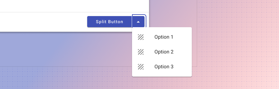
Split buttons communicate multiple actions that users can take. The split button provides a dedicated, suggested action while also providing an option to choose alternate related actions.
For groups of buttons or switches to control aspects of a page, or to create a toolbar, see button toggle.

The default usage keeps secondary options in a dedicated overflow menu. The options contain actions related to the primary action.
Use when
- There are multiple related choices for a single actionable item.
- Space is confined where multiple buttons will not fit in an area.
Don’t use when
- Actions are unrelated to one another. Use individual buttons or icon buttons instead.
Types

The three types of button: 1. Raised, 2. Outlined, 3. Flat.
Like buttons, there are three types of the split button variant: 1. Raised (high emphasis), 2. Outlined (medium emphasis), and 3. Flat (low emphasis). These types should be used in the same way as they’re used with buttons. See Button > Types for more information.
Best practices
Keep secondary actions similar and related to the main primary action.
Limit the amount of related actions to a maximum of 3, if possible, to prevent over complicating the action being taken.
Use sentence casing for buttons. ("Start new" instead of "Start New" or "START NEW")
Use flat buttons sparingly; outlined buttons are better for accessibility reasons.
Use succinct and actionable words ("Submit", "Close", "Cancel", "Start scheduling", instead of "Start a new instance of this week's schedule," "Wheelmaster").
Use words that are familiar to your user: "Submit" instead of "Accept" or "Commit."
Use the default, primary color for buttons.
For inline actions, place buttons close to the content they act on.
Don't use the Forge success or warning colors for buttons. Use the primary default instead.
Don't use more than one primary (Raised, high emphasis) button on a page, or more than one in a dialog.