Blocks
Pre-built UI patterns and layouts to accelerate development.
Application Layout
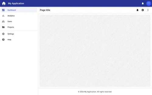
Basic Application Layout
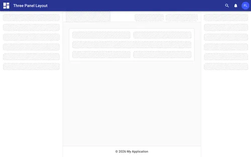
Standard application shell featuring a top app bar with logo, title, icon action buttons, and user profile menu with theme toggle; a le...
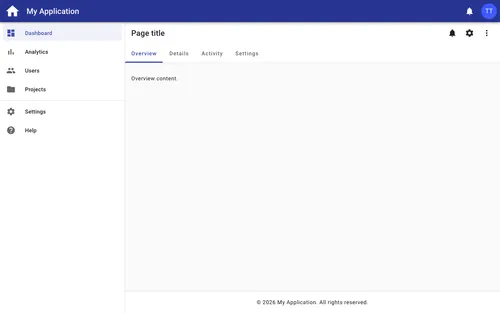
Basic Application Layout with Tabs
Standard application shell with a borderless page toolbar and tab bar navigation below it, featuring a top app bar with logo, title, ic...
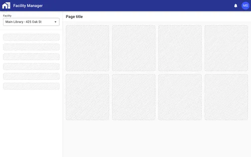
Compact Context Switcher
Application layout with a compact context switcher in the navigation drawer. The selected context (organization, property, account, wor...
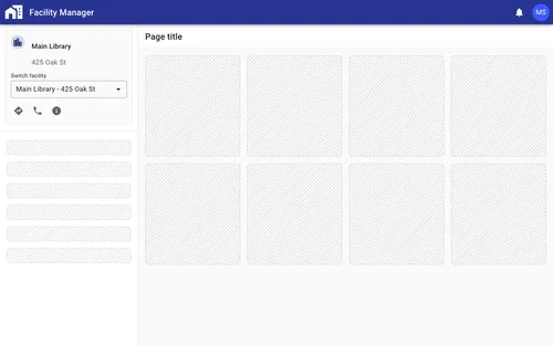
Detailed Context Switcher
Application layout with a detailed context switcher in the navigation drawer. The selected context (organization, property, account, wo...
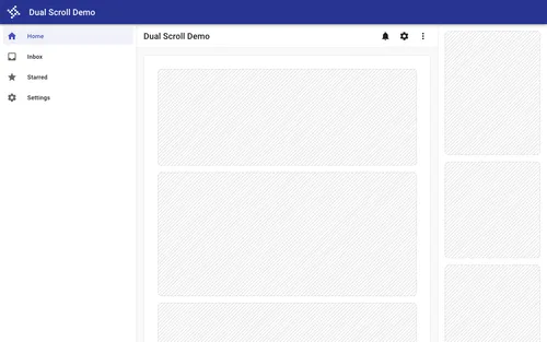
Dual Scrolling Containers
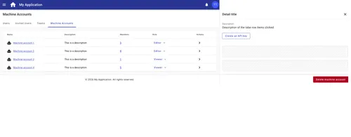
Application layout demonstrating dual independent scrolling regions where the main content area and a fixed right-side drawer panel eac...
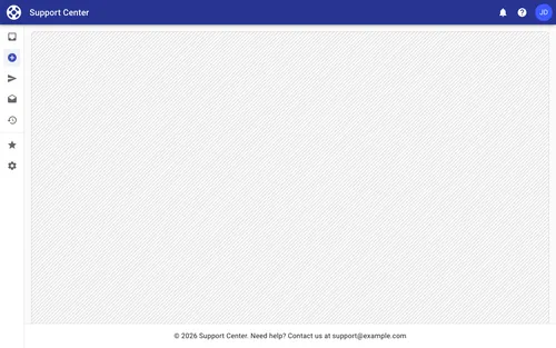
Mini Nav Application Layout
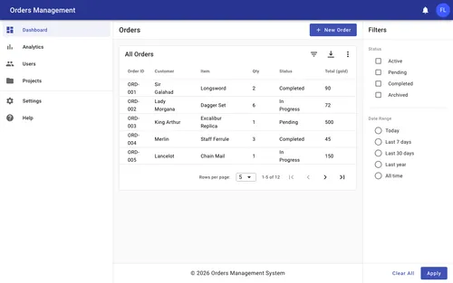
Application shell with a collapsible mini navigation drawer that expands on hover, an app bar with notification icons and a user profil...
Cards

Avatar Card
Profile card with a large centered avatar, name, email link, corner notification badge, and an inverted toolbar footer with actions
Basic Card
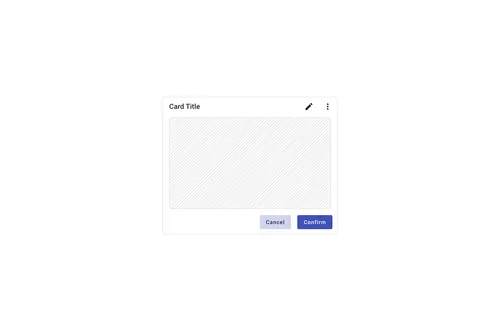
Structured card with header, header actions, body content area, and footer with action buttons
Cohort Status Card
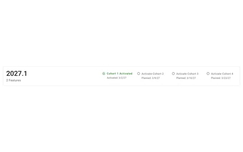
Responsive card with a summary section (title and subtitle) on the left and a multi-column status grid on the right showing progress th...

Icon Card
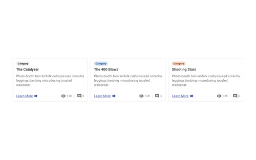
Action card featuring an icon, title, and description for quick navigation or feature highlights
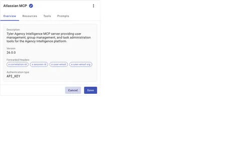
Data Display
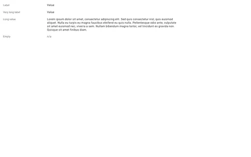
Dialogs
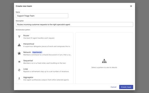
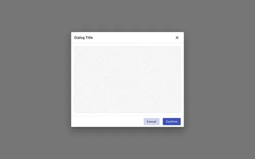
Dialog — New object with template selection list
Modal dialog that pairs a short form (name and description fields) with a two-pane master-detail option picker: a scrollable list of se...
Forms
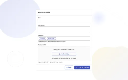
Add Illustration Form
Centered card form displayed over a decorative background with abstract SVG elements, featuring a header with icon and title, text inpu...
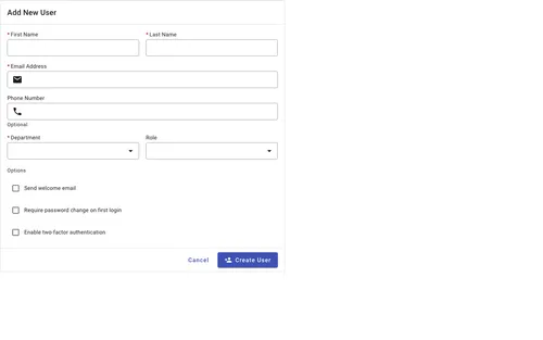
Add User Form
Form card with two-column grid layout for text inputs, leading icons, support text, dropdown selects, grouped checkboxes, and action bu...
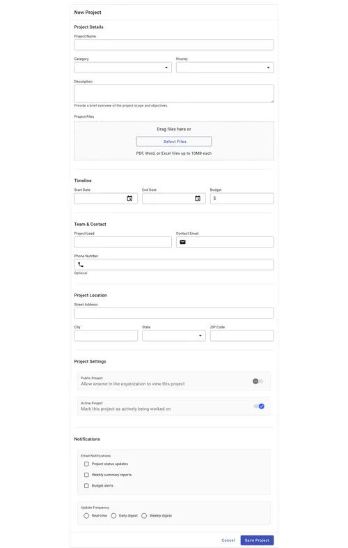
Complex Form with Grouped Sections
Responsive form divided into logically grouped sections (project details, timeline, team, location, settings, notifications) using a 6-...
Lists
Patterns

Scaffold Examples
Tables
Paginated Table
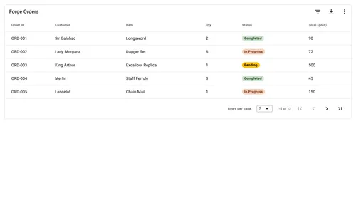
Data table with client-side pagination inside a structured card, featuring header action buttons for filtering, exporting, and addition...
Simple Table
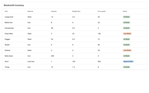
Data table component wrapped in a card container with a toolbar header, demonstrating column configuration and data binding for display...
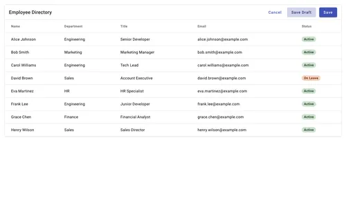
Table with Actions
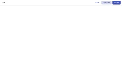
Data table inside a card with a toolbar header featuring action buttons for cancel, save draft, and submit operations
Toolbars

Card Header Toolbar
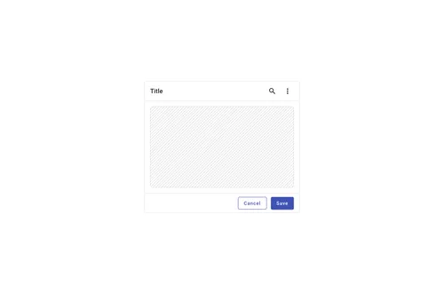
Card header toolbar for a forge-scaffold header slot, with the card title in the start slot styled at heading3

Card Header Toolbar with Actions
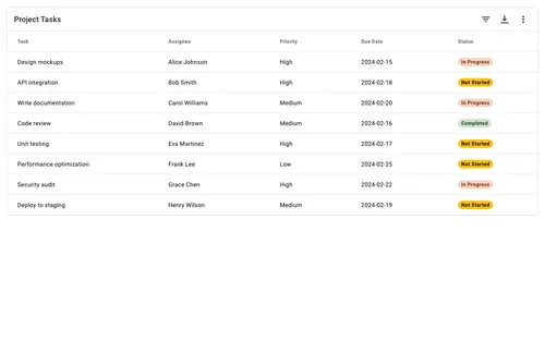
Card header toolbar with the card title in the start slot and medium-density icon buttons for filter, export, and more options grouped...
Page Title
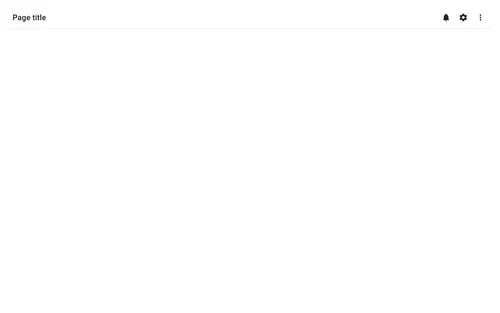
Toolbar with page title heading and action icon buttons for notifications, settings, and more options