Footer
Overview
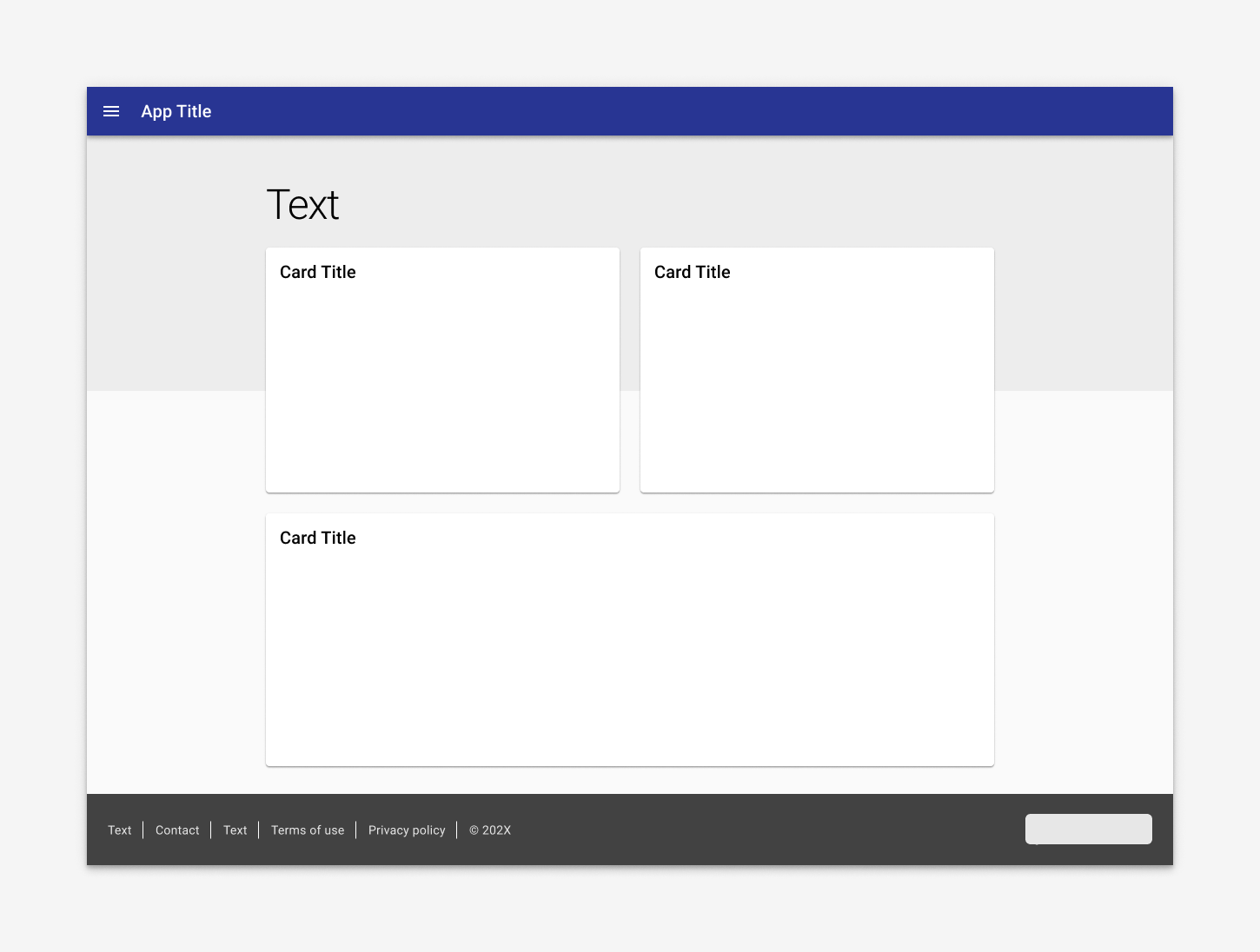
Resident apps use a footer that refers to the client / municipality. The footer is used on landing pages only.
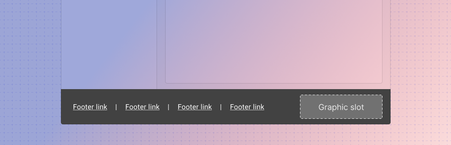
The footer is comprised of slotted text or hyperlinks that can be customized by the client / municipality, along with a dedicated slot for a small graphic, such as a logo. Links open in a new tab.
Use when
- Use on landing pages.
- Use in resident apps.
Don't use when
- Don't use on pages that have persistent controls at the bottom of a screen, such as forms.
Responsive
On desktop, items are left aligned and logo is right aligned; on desktop, the items are centered and display vertically. The footer is responsive by default and will display in its mobile format at a breakpoint of 900px, but its breakpoint can be customized.
Additionally, teams can set the footer to display in its default (standard) or mobile (alternative) mode using the layout attribute.
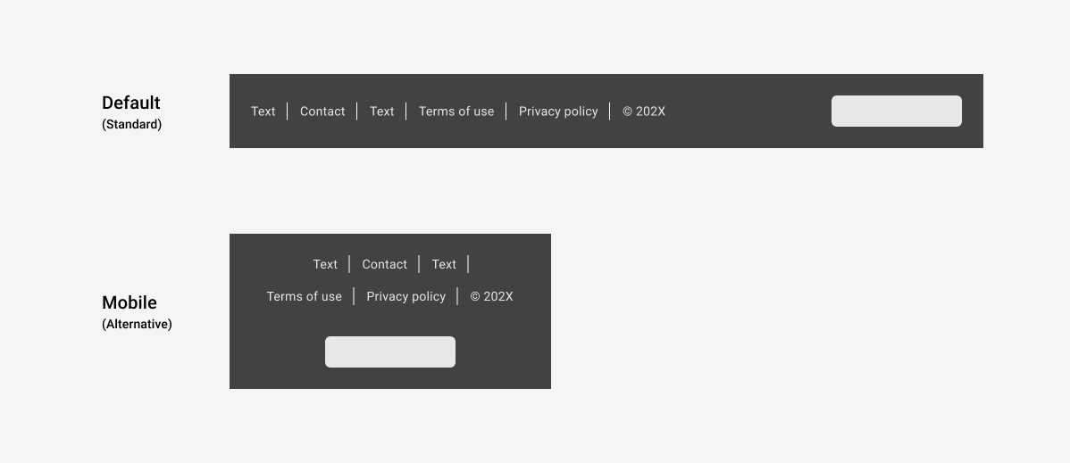
When switching to mobile view, the text and hyperlinks stack on top of the logo section vertically.
Best practices
Footers should move as the page scrolls.
When body content is shorter than the visible viewport, place footer at the bottom of the viewport.
Footer links open in a new tab.
Don't fix a footer to be peristently visible.
When body content is shorter than the visible viewport, place footer at the bottom of the viewport.