Tooltip
Overview
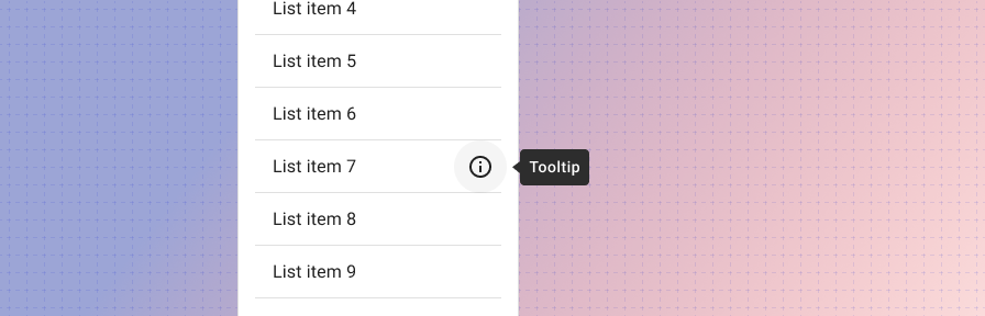
When activated, tooltips display a text label identifying an element, such as a description of its function.
Use when
- An icon button is displayed without a label.
- An icon or function needs additional explanation.
Don't use when
- Mobile is a primary context of use. Hover affordances won't work; a long press might work instead.
- The description is more than a few words. Use a rich text tooltip instead. (Coming soon!)
Best practices
check_circle_outline
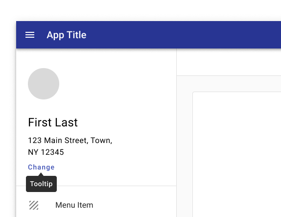
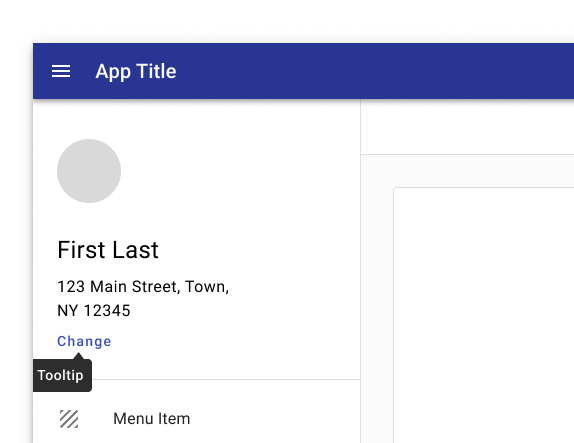
A tooltip is continuously displayed for as long as a user hovers over the element (desktop) or holds the element (mobile).
check_circle_outline
On desktop, tooltips appear in the center of click targets and stay in place while cursor moves within the target.
check_circle_outlineDo
Keep the position of the tooltip visible.
cancelDon't.
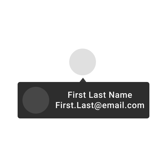
Don’t crop tooltips.

cancelDon't.
Don’t use tooltips to restate visible UI text.
cancelDon't.
Don’t display rich information and imagery on tooltips.
Related
Components
- Icon buttons should be accompanied by a tooltip.