File picker

Overview
File pickers are commonly founds in forms, but they can also live as stand alone elements. Users can drag files to a target area or hit a button to add from their local folder system. Default text for then button is "Select a file" (for a single file upload) or "Select files" (for multi file upload.)
The file picker supports uploading single or multiple files. Uploaded files display in a list or grid of thumbnails.
Parts
The default file picker is comprised of six sections.
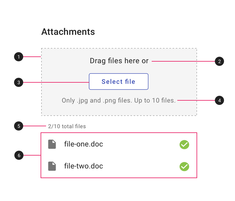
- Drag & drop target area. The target into which users can drag files.
- Primary text. "Drag files here or" by default.
- Button. "Select file" or "Select files" by default. Text and button may be customized as needed.
- Secondary text. (Optional) If needed, use this text for any constraints or parameters, such as file type or size.
- File count. (Optional) If there is a maximum number of files, use this text to display how many files have been uploaded so far.
- File list. May be displayed as a list (recommended for text or data files) or a thumbnail grid (recommended for image files).
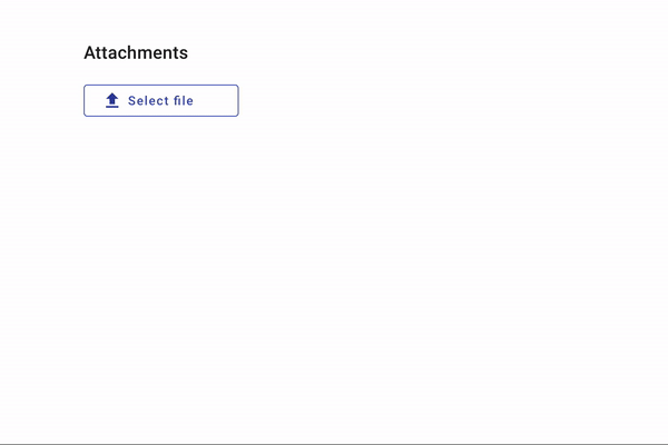
The dense version displays only the "Select" file button and is best used when space is limited and drag & drop is not needed.
Types
1. Default - list
Display text or data files in a list.
2. Thumbnail grid (images)
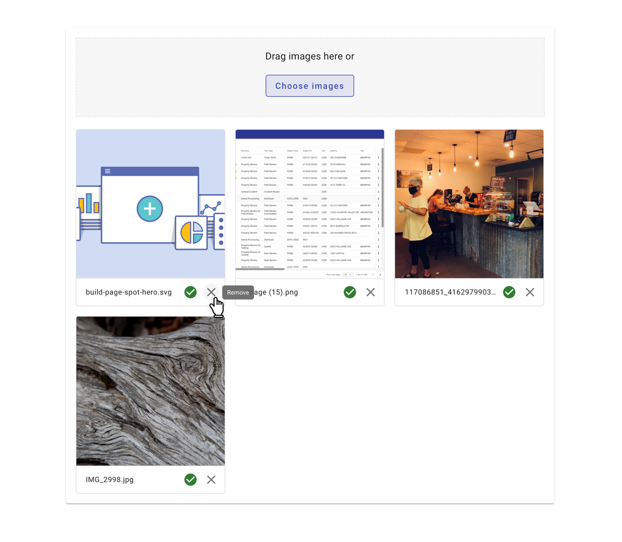
Display images files in a grid.
3. Dense (limited space)
Behavior
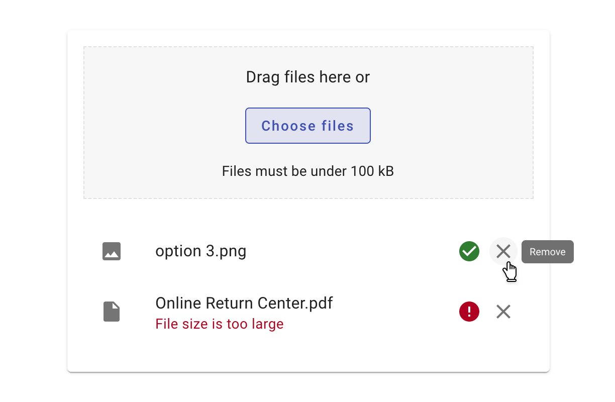
Uploaded files should:
- Indicate loading progress and completion.
- Display any errors, their cause, and the ability to remove the file.
- Allow users to edit filenames on double-click (if applicable)
- Allow files to be deleted.
- Truncate long file names with an ellipsis.
View recipes for the file-picker component here.
Related
Components
- Uploaded files display as a list.
- Uploaded files should use progress spinners to indicate progress as files upload.
- The button in the file picker may be customized.