Calendar

Overview
The calendar component can be used as part of the date picker or on its own.
Use when
- The task is primarily calendar-driven and the calendar is used for reference, such as selecting dates for a time off request.
- Users need to select multiple dates that may not be chronological.
Don't use when
- Users are entering familiar dates such as credit card expirations, birthdays, anniversaries, etc. Use a date picker that allows for text input instead.
- The calendar component isn't central to the task at hand. Use a date pickerinstead.
- Screen real estate is limited. Use a date picker instead.
Anatomy
The calendar is comprised of the following parts:
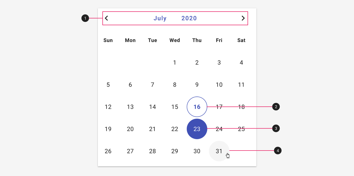
- Month and year selector. Users may tap the month or year to change them, or use the paginators to scroll through previous and next months.
- Today's date.
- Hover state.
- Hover state.