Floating action button
Overview
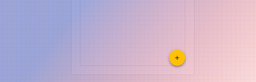
A floating action button (FAB) performs the primary, or most common, action on a screen. Primarily a mobile pattern, it appears in front of all screen content, typically as a circular shape with an icon in its center. FABs come in four types: regular, mini, extended, and speed dial.
Use when
- A page truly has a primary action.
Don't use when
- A page has multiple actions that are equally likely. For example, if adding a new record or editing an existing record are equally likely, a FAB should not be used to indicate "add." Use a button instead.
Types
There are four types of floating action button: 1. Default 2. Mini 3. Extended FAB 4. Speed dial.
Default
The default FAB uses an icon only.
Mini FAB
A mini FAB should be used on smaller screens. When a screen width is 460dp or less, the container of a default FAB (56dp) should transform into the mini size (40dp).
Extended FAB
The extended FAB includes a text label and optional icon. Use an extended FAB for actions that may not have a familiar icon ("Move to another folder," "Allocate," "Start workflow"). For more information on when to use text vs icon buttons, check out the button guidance.
Speed dial
When pressed, a FAB can display three to six related actions in the form of a speed dial. This transition can occur in one of the following ways:
- Upon press, the FAB can emit related actions
- Upon press, the FAB can transform into a menu containing related actions.
- If more than six actions are needed, something other than a FAB should be used to present them.
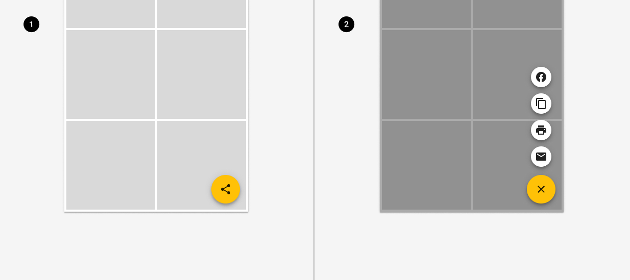
A FAB displays a stack of related actions.
Placement
On mobile (native and web responsive), a FAB may attach to a seam or may be placed in the bottom right of the screen; pinned in place even as content scrolls. A pinned fab is placed 24px from the bottom and left of the visible viewport.
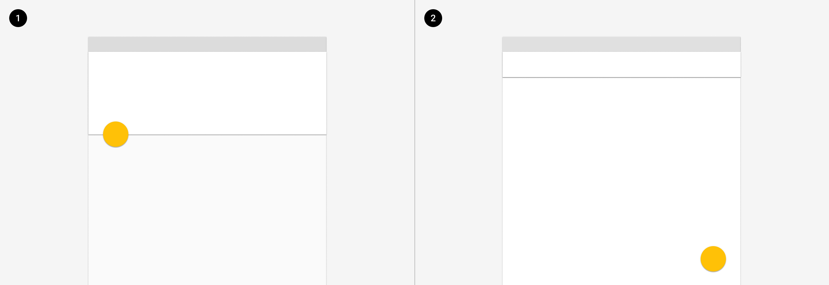
1. On mobile, a FAB can attach to a seam.
2. A FAB may be placed in the bottom right of the screen.
On desktop, a FAB may attach to the edge of a card or may be placed in the bottom right of the screen; pinned in place even as content scrolls. A pinned fab is placed 24px from the bottom and left of the visible viewport. Consider whether the FAB will block important content or controls; if so, consider a raised button instead.
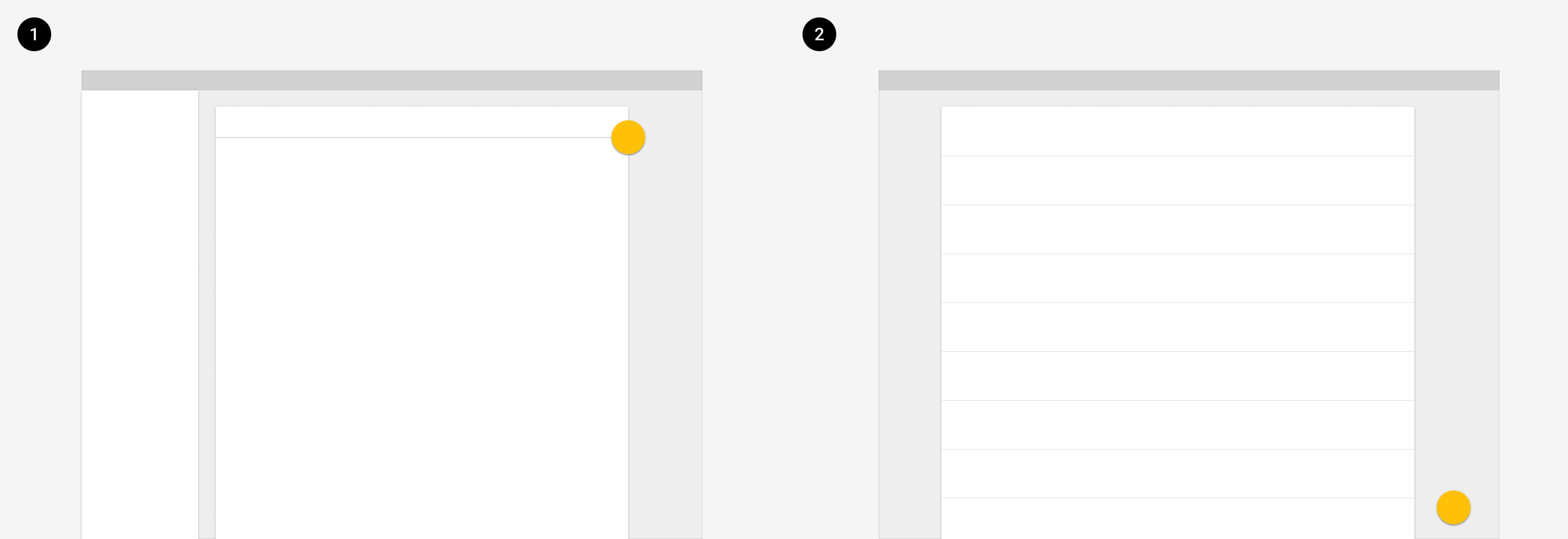
1. A FAB can attach to the edge of a card.
2. A FAB may be placed in the bottom right of the screen, pinned 24px from the right and 24px from the bottom of the screen.
Where viewing records or adding records may be equally likely, use a raised button to indicate the action add.
Best practices
Consider whether your page has a single, primary action. If so, a FAB is appropriate. Otherwise consider a raised button.
If an icon is used in an extended FAB, it should be placed to the left of the text.
Don't use a FAB when it may obscure important content such as records or controls.
Don't display more than one FAB on a page.
Don't layer badges or other elements in front of a FAB.
Don't place text in a regular FAB.
Avoid using a FAB for minor or destructive actions, such as: archive or trash, alerts or errors.
Avoid using a FAB if its position would place it too far from the content it acts on.
Related
Components
- Use a button to display actions that aren't the primary action on a page.
Patterns
Coming soon!